| Author | Thread |
Comments Made During the Challenge  |
|
|
08/11/2002 08:13:00 PM |
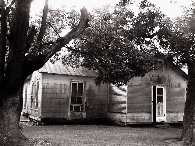
Nice house... wish it were't blown out at the top.
4 sjgleah |
|
 Photographer found comment helpful. Photographer found comment helpful. |
|
|
08/11/2002 05:05:00 PM |
| I really like the natural framing the trees gave you and the washed out top adds to the mysteriousness of this picture 10 |
|
| Photographer found comment helpful. |
|
|
08/10/2002 07:36:00 PM |
| Great job on the subject matter and the brightness/contrast on the black and white. I also like how the house is "framed" with the trees. |
|
| Photographer found comment helpful. |
|
|
08/10/2002 01:52:00 PM |
| Subject good, but tree distracts. Less framing might have let the main subject of the picture be the main subject. |
|
| Photographer found comment helpful. |
|
|
08/09/2002 03:02:00 PM |
| Would have cropped out the top due to blooming. Not bad. |
|
| Photographer found comment helpful. |
|
|
08/08/2002 05:13:00 PM |
| Was the glare across the top on purpose? I don't get any extra meaning from it. I kinda like the glare through the tree leaves. 6 Swash |
|
| Photographer found comment helpful. |
|
|
08/08/2002 10:30:00 AM |
| Excellent exposure, great touch of color & very nice composition. You should end up in the top 10! I'm gonna add this one to my favorites. :-) sylk |
|
| Photographer found comment helpful. |
|
|
08/08/2002 06:09:00 AM |
| It's an excellent subject for the photo and I like how you attempt to frame it within the trees. Just a couple of nit picks - there's a little glare at the very top edge of the picture and there's a black 'well' in the middle of the picture where there's no detail. Definitely captures the feeling of oldness though. Well done. |
|
| Photographer found comment helpful. |
|
|
08/07/2002 04:23:00 PM |
| This is an interesting old house... the blow out along the top of the image is a little harsh though... :) - jmsetzler |
|
| Photographer found comment helpful. |
|
|
08/07/2002 01:25:00 PM |
|
|
|
08/07/2002 11:07:00 AM |
| Compostion is a little off, makes it look unbalanced. I like the way the trees fuse together, could havve uses that better, and what is supposed to be the eyecatcher here? I would have used to half open door becasue the white makes such a nice contrast but it is too far off to the right. |
|
| Photographer found comment helpful. |
|
|
08/07/2002 10:45:00 AM |
This is one old house!
The black and white make this photo look a little flat. The upper portion is a bit overexposed, and the trees framing the house don't seem to help here.
--4-- sohr |
|
| Photographer found comment helpful. |
|
|
08/05/2002 10:18:00 PM |
| I like how you used the trees to frame this house. The effect of the sun shining through the leaves at the top is interesting, but a bit distracting. |
|
| Photographer found comment helpful. |
|
|
08/05/2002 07:24:00 PM |
|
Home -
Challenges -
Community -
League -
Photos -
Cameras -
Lenses -
Learn -
Help -
Terms of Use -
Privacy -
Top ^
DPChallenge, and website content and design, Copyright © 2001-2025 Challenging Technologies, LLC.
All digital photo copyrights belong to the photographers and may not be used without permission.
Current Server Time: 03/13/2025 02:21:30 AM EDT.