| Author | Thread |
Comments Made During the Challenge  |
|
|
10/14/2003 01:26:31 PM |
| Great color, I like the building. |
|
 Photographer found comment helpful. Photographer found comment helpful. |
|
|
10/13/2003 02:49:08 AM |
base 1: 1/1; challenge: 2/3; technical: 2/3; aesthetics: 1/3; total: 6
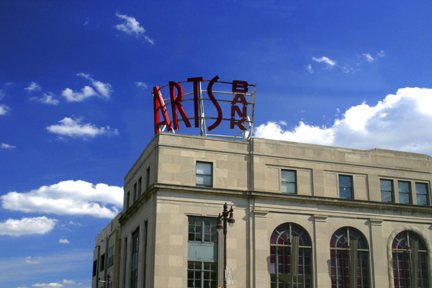
The 'ARTS' is way too center. I would have cropped closer to the building. Only one building, missing the 'photo of buildings' part of the challenge. |
|
| Photographer found comment helpful. |
|
|
10/10/2003 02:12:23 PM |
| Oooh, I like the contrasts of the red in the sky. I'm not sure if it was done on purpose or not, but I like how you've left the area behind the free of clouds to stand out more. I was going to suggest that a shot more to the left would have captured the "A" a little better but then I realized that would have brought in the clouds. Well done. |
|
| Photographer found comment helpful. |
|
|
10/10/2003 10:30:11 AM |
| It's a good picture, a little small though. You could have probably put the sign in the top-left third and captured more of the building. That's just a personal opinion though. Maybe you would have lost the clouds though. |
|
| Photographer found comment helpful. |
|
|
10/09/2003 10:38:16 PM |
| The colors are beautiful, but the picture just doesn't excite my interest. Maybe a different perspective, or up closer. |
|
|
|
10/09/2003 05:37:03 PM |
| A very clear and sharp image but lacking anything that would really grab my attention and hold it. I'm thnking that maybe if the ARTS sign was not as centered and more of the building was showcased I would like this much better. Raising my original score but only by a few points. |
|
| Photographer found comment helpful. |
|
|
10/08/2003 02:41:23 PM |
| Was thsi taken through a window? There are strange reflections to the right of the sign which detract from the great sky. The contrast of the sign and building is good, but most of the sign is in shadow so you lose a lot of the color. The building could probably be straightened up a little as well. |
|
| Photographer found comment helpful. |
|
|
10/08/2003 12:30:04 PM |
| very rick and brite color nice shot. |
|
| Photographer found comment helpful. |
|
|
10/08/2003 10:24:58 AM |
| Framing the logo higher and to the right would have improved this shot (imho). |
|
| Photographer found comment helpful. |
|
|
10/08/2003 01:11:23 AM |
| Nice shot. I like the colors. I think it might help to crop off about half of the sky that runs top to bottom to the left of the building. |
|
| Photographer found comment helpful. |
Home -
Challenges -
Community -
League -
Photos -
Cameras -
Lenses -
Learn -
Help -
Terms of Use -
Privacy -
Top ^
DPChallenge, and website content and design, Copyright © 2001-2025 Challenging Technologies, LLC.
All digital photo copyrights belong to the photographers and may not be used without permission.
Current Server Time: 03/13/2025 07:59:04 PM EDT.