| Author | Thread |
Comments Made During the Challenge  |
|
|
08/11/2002 11:25:00 PM |
| I think this is a great subject for the challenge, but the lighting is very weak. |
|
|
|
08/09/2002 11:45:00 AM |
| Theme is a little forced with the obvious centered date. reflection on the Cher cover is unfortunate. |
|
|
|
08/07/2002 06:38:00 PM |
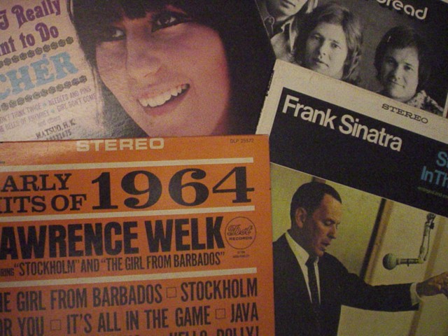
Wow, this is an OLD collection! This is an interesting concept. The CHER album is still too glossy and reflects light back (sad). Frank's album seems grainy and dark. You also got some glare on the EArly Hits Of 1964. The Best of Bread seems like it came through the best, but is mostly obsured. Think you used about the right number of LP covers, but need to work on the lighting/exposure issues.
6 Swash |
|
|
|
08/07/2002 04:01:00 PM |
| This collage sure brings back some memories.....the technical quality could be better....less fuzzy and less lens flare. |
|
|
|
08/07/2002 11:59:00 AM |
| nice collage and your dullness adds to the age |
|
|
|
08/07/2002 06:56:00 AM |
| interesting collection :) the image looks slightly grainy... the lighting may need a minor improvement to make the image punch harder... - jmsetzler |
|
|
|
08/05/2002 10:26:00 PM |
Something old. Use your photographic technique to emphasize the age of your subject.
Composition - good
Technical Aspects - good
Meets Challenge - yes
Visual Impact / Originality - ok. Needs light?
|
|
|
|
08/05/2002 07:10:00 PM |
I'm being blunt - it's flat. I'm sure this has meaning to you, but it doesn't do much for me. I see: a 'snapshot' of album covers, ever so slightly arranged. I understand the idea. The photo needs a little more depth. What I like about photos is the 2 dimension. I would suggest adding something else that is not flat. The focus is pretty good - but did you try different DOFs? There isn't something particular to see, that really draws the eye to. Don't be offended - just keep going. 4
Ruthann |
|
|
|
08/05/2002 02:08:00 PM |
| Cher has a glare. Nice idea. |
|
Home -
Challenges -
Community -
League -
Photos -
Cameras -
Lenses -
Learn -
Help -
Terms of Use -
Privacy -
Top ^
DPChallenge, and website content and design, Copyright © 2001-2025 Challenging Technologies, LLC.
All digital photo copyrights belong to the photographers and may not be used without permission.
Current Server Time: 03/13/2025 02:37:45 AM EDT.