| Author | Thread |
Comments Made During the Challenge  |
|
|
08/11/2002 05:16:00 PM |
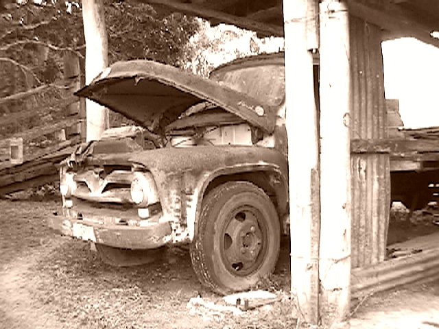
| looks it its suffered from compression a bit. The support in the middle right is in the way |
|
|
|
08/10/2002 05:16:00 PM |
| This looks like the original was only 320x200. It's all blocky and pixellated :-(. |
|
|
|
08/09/2002 11:13:00 AM |
| Good subject. Unfortunate JPEG problem in resizing. Sepiatone makes for "forced" notion of oldness, when the suject produces this feeling itself. Good effort. |
|
|
|
08/09/2002 10:07:00 AM |
| Nice subject, good composition, but the artifacts in this shot take away from it... i.e. the compression or over enhanced? Dunno, but it's not sharp or clear. The brights are too bright, and the shadows look muddy. Maybe alot of this happened with the compression? |
|
|
|
08/09/2002 08:02:00 AM |
| Far too many compression effects, this looks like its been transmitted by fax. |
|
|
|
08/08/2002 09:13:00 AM |
| this is an excellent comcept, but the photo is very pixellated... soft focus is ok on 'old' shots but the jagged edges here are quite distracting.. - jmsetzler |
|
|
|
08/08/2002 03:36:00 AM |
| seems to lack sharpness and suffer from over-exposure. right 1/3 of picture is wasted -- perhaps a vertical crop would have been more to your advantage |
|
|
|
08/06/2002 01:49:00 PM |
| Nice shot but over exposed! |
|
|
|
08/06/2002 11:58:00 AM |
| composition good..color good..could be sharper. |
|
|
|
08/06/2002 11:29:00 AM |
| cool subject matter. nice composition. too soft and the whites are too blown out. maybe that was intended. |
|
|
|
08/06/2002 08:44:00 AM |
| Woo - great subject! Your picture is a little over exposed in places and I think perhaps you could have moved a little to minimise the impact of the vertical beams towards the right. But this is one of the few photos where I think sepia tone has helped it. Well done. |
|
|
|
08/06/2002 07:32:00 AM |
| good, the picture even looks old :-) a little out of focus isn't it? |
|
|
|
08/05/2002 08:24:00 PM |
| might work better as a vertical crop |
|
|
|
08/05/2002 08:04:00 PM |
| Great picture, but the over white area on the right takes away from the overall feel of age. (6) |
|
|
|
08/05/2002 06:44:00 PM |
| Either you have over sharpened or over compressed this image... or maybe you have a Fijifilm Super CCD? |
|
|
|
08/05/2002 05:38:00 PM |
| the idea is good, the composition, too, but the picture quality could be better IMO. the photo seems a little pixelated (even though your file size is fine, so i don't know whether it's the camera or any of the post processing you did). overall, the photo is too bright, there are some large blown out areas (posts in the foreground, sky, bits on the truck) and a little more contrast would be better IMO, too. -- gr8photos (3) |
|
|
|
08/05/2002 01:41:00 PM |
| whites are too bright, s ee pixels showing, compostion lacks a strong focus |
|
|
|
08/05/2002 01:40:00 PM |
| that's not retired. It's dead. |
|
|
|
08/05/2002 11:41:00 AM |
| A little too blurry and overexposed to me. Was that intentional? Lisa |
|
|
|
08/05/2002 11:32:00 AM |
| Great old truck! This seems a bit light to me, though |
|
|
|
08/05/2002 10:36:00 AM |
| Very nice but I would prefer a different angle. mjl 5 |
|
|
|
08/05/2002 09:25:00 AM |
| this would have been an wesome shot had it not been for the pixelation |
|
|
|
08/05/2002 08:22:00 AM |
|
Home -
Challenges -
Community -
League -
Photos -
Cameras -
Lenses -
Learn -
Help -
Terms of Use -
Privacy -
Top ^
DPChallenge, and website content and design, Copyright © 2001-2025 Challenging Technologies, LLC.
All digital photo copyrights belong to the photographers and may not be used without permission.
Current Server Time: 03/12/2025 07:14:27 PM EDT.