| Author | Thread |
Comments Made During the Challenge  |
|
|
10/14/2003 05:21:00 PM |
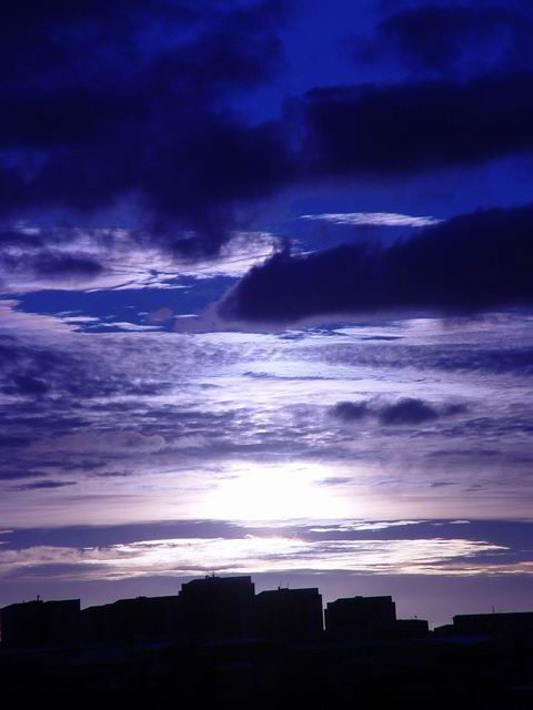
| Awesome sky, I like the color, good shilloette. |
|
 Photographer found comment helpful. Photographer found comment helpful. |
|
|
10/13/2003 06:36:55 PM |
| The buildings' silhouette is kind of boring, but I like this otherwise. The blue is really nice. |
|
| Photographer found comment helpful. |
|
|
10/13/2003 02:20:49 PM |
| Nice idea, and great colors. I'm not sure that the buildings have an interesting enough outline to warrant a photo however. Maybe the same shot from a different location would have worked even better. |
|
| Photographer found comment helpful. |
|
|
10/12/2003 05:54:52 PM |
| Amazing color! Should have cropped the top half of the sky |
|
| Photographer found comment helpful. |
|
|
10/11/2003 09:58:40 PM |
| stunning sky, but for this challenge seems to be a bit too much sky and not enough landscape. |
|
| Photographer found comment helpful. |
|
|
10/10/2003 10:12:18 PM |
| Very nice color range and good cloudscape. |
|
| Photographer found comment helpful. |
|
|
10/10/2003 03:20:16 PM |
| main impact is the sky not the urban part of the picture. Perhaps if the shapes where more identifiable. |
|
| Photographer found comment helpful. |
|
|
10/10/2003 11:55:01 AM |
| Good idea, the sky is very beautiful. The picture might be a bit more effective if the buildings presented a stronger, more defined silhouette (not a sort of flat line with just a couple small breaks). I don't know, something to try. |
|
| Photographer found comment helpful. |
|
|
10/09/2003 11:06:54 PM |
| the sky looks nice, but the buildings at the bottom are uninspiring, seem too linear. 7 |
|
| Photographer found comment helpful. |
|
|
10/09/2003 04:03:49 PM |
|
| Photographer found comment helpful. |
|
|
10/09/2003 03:51:49 PM |
|
| Photographer found comment helpful. |
|
|
10/09/2003 02:59:52 PM |
| I like the color of the sky - but I don't really see the distinctness of the buildings at the bottom. Nice concept. |
|
| Photographer found comment helpful. |
|
|
10/08/2003 09:53:22 PM |
| Now that's blue! Very dramatic piece. |
|
| Photographer found comment helpful. |
|
|
10/08/2003 07:57:30 PM |
| Overall a very nice shot, great use of negative space but as far a meeting the challenge, the building are lost in the landscape and I think if they were more defined or visable instead of outlined I could have scored much higher on this. |
|
| Photographer found comment helpful. |
|
|
10/08/2003 09:55:36 AM |
|
| Photographer found comment helpful. |
|
|
10/08/2003 09:35:50 AM |
| Visual appeal 3/4, technical 2/3, meeting the challenge 3/3 - 8/10 |
|
| Photographer found comment helpful. |
|
|
10/08/2003 07:55:06 AM |
| Maybe a little too much sky ... very nice though |
|
| Photographer found comment helpful. |
|
|
10/08/2003 01:57:01 AM |
base 1: 1/1; challenge: 2/3; technical: 2/3; aesthetics: 1/3; total: 6
Nice sky shot, but low silhouette of buildings doesn't shout urban to me. |
|
| Photographer found comment helpful. |
Home -
Challenges -
Community -
League -
Photos -
Cameras -
Lenses -
Learn -
Help -
Terms of Use -
Privacy -
Top ^
DPChallenge, and website content and design, Copyright © 2001-2025 Challenging Technologies, LLC.
All digital photo copyrights belong to the photographers and may not be used without permission.
Current Server Time: 04/27/2025 12:37:00 PM EDT.