| Author | Thread |
Comments Made During the Challenge  |
|
|
08/11/2002 09:33:00 PM |
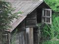
| Yes, its old, but it feels washed out to me. 5 sjgleah |
|
 Photographer found comment helpful. Photographer found comment helpful. |
|
|
08/10/2002 04:11:00 PM |
| This is nice, but there is no depth to it. My suggestion is more contrast which would bring out more of the shadows and dark and thus make your pic more pleasant. Keep it up! |
|
| Photographer found comment helpful. |
|
|
08/10/2002 10:24:00 AM |
| Wonderful handling of multiple tones. One of my top three this week. Jak |
|
| Photographer found comment helpful. |
|
|
08/10/2002 03:53:00 AM |
| contrast can be increased |
|
| Photographer found comment helpful. |
|
|
08/09/2002 12:13:00 PM |
| Excellent subject. Would definitely make this a couple of stops darker. |
|
| Photographer found comment helpful. |
|
|
08/08/2002 07:59:00 PM |
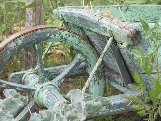
| Very nice shot! Now that looks old! Except for the plant in the foreground blending in with the wheel, this is very good. This shot grows on me, started out as a 7, but with more reflection and viewing, I think it's closer to a 9. Swash |
|
| Photographer found comment helpful. |
|
|
08/08/2002 10:17:00 AM |
| for me, the plant in the foreground is distracting me from relishing the amazing patina of the cart. The...tomato?...bothers me more than the ...cabbage? I know the argument could be made that they frame it, but they seem discordant to me. What a beautiful cart. I hope you keep shooting it when the flora have gone. |
|
| Photographer found comment helpful. |
|
|
08/08/2002 07:28:00 AM |
| Lovely angle and framing. Slightly over light I think. |
|
| Photographer found comment helpful. |
|
|
08/07/2002 09:28:00 PM |
| This is a wonderful old garden wheel barrow. You have done a nice job with near perfect lighting. The only problem I see is that portions of the subject on the very top are blown out with a little too much light. Otherwide great. Autool |
|
| Photographer found comment helpful. |
|
|
08/07/2002 03:37:00 PM |
| Love the monochromatic texture. |
|
| Photographer found comment helpful. |
|
|
08/07/2002 10:34:00 AM |
| Your composition of this shot is what makes this an interesting picture. Nicely done. |
|
| Photographer found comment helpful. |
|
|
08/06/2002 11:25:00 PM |
| I like the different greens in this picture, though I also think it would be awesome if there were another contrasting color somewhere. Great angle/perspective and framing. karmat |
|
| Photographer found comment helpful. |
|
|
08/06/2002 09:30:00 PM |
| I like the monochrome colors in this photo. Very cool feeling and rustic. This must be a great garden. |
|
| Photographer found comment helpful. |
|
|
08/06/2002 01:44:00 PM |
| Good idea filling the frame with the main subject since its color is so simillar to its surroundings and would get lost if it were any less. |
|
| Photographer found comment helpful. |
|
|
08/06/2002 10:24:00 AM |
| I would have liked to have seen the entire barrow. Apart from that � good shooting� |
|
|
|
08/05/2002 09:43:00 PM |
Something old. Use your photographic technique to emphasize the age of your subject.
Composition - Very good
Technical Aspects - Very good
Meets Challenge - yes+
Visual Impact / Originality - high
Looks like a painting. Great job. In my top 3. |
|
| Photographer found comment helpful. |
|
|
08/05/2002 08:03:00 PM |
for me, finding this photo was like discovering a diamond in the rough. lovely in its own right, but it was clear that with a little polishing through photoshop by tweaking the levels, contrast, saturation, sharpening, etc... that this photo would be a real gem. if you dont use photoshop or one of its equivalents, i urge you to look into doing so. myself and many others on this site would be happy to answer any questions you may have about their use. ~mcmurma (revised 8/11 because i felt the wording in the original was a bit harsh and subject to misinterpretation. my apologies if it offended in any way)
Aesthetics...7 (as is, it would be a 9 or 10 if tweaked)
Meets Challenge...9
Overall...8 |
|
| Photographer found comment helpful. |
|
|
08/05/2002 04:37:00 PM |
| I definitely think this is good work :) I wish there was a way to add some contrast thought... I also wonder if a different angle would have allowed you to remove the wooden post from the image... good work :) - jmsetzler |
|
| Photographer found comment helpful. |
|
|
08/05/2002 03:49:00 PM |
| Nice composition and beautiful "color palette" - very pleasing to look at. lhall |
|
| Photographer found comment helpful. |
|
|
08/05/2002 02:41:00 PM |
| Very nice. The color seems a bit washed out -- would like to see more definition of the colors. |
|
| Photographer found comment helpful. |
|
|
08/05/2002 12:04:00 PM |
| very good color and focus and title... |
|
| Photographer found comment helpful. |
|
|
08/05/2002 10:59:00 AM |
| A little bit light and (I think) needs more contrast.Otherwise nice pix. |
|
| Photographer found comment helpful. |
|
|
08/05/2002 10:28:00 AM |
| Wonderful colour. Almost surreal. |
|
| Photographer found comment helpful. |
|
|
08/05/2002 10:19:00 AM |
| this must be right in the garden. It looks like I can see Cabbage and some tomatoes |
|
Home -
Challenges -
Community -
League -
Photos -
Cameras -
Lenses -
Learn -
Help -
Terms of Use -
Privacy -
Top ^
DPChallenge, and website content and design, Copyright © 2001-2025 Challenging Technologies, LLC.
All digital photo copyrights belong to the photographers and may not be used without permission.
Current Server Time: 03/12/2025 05:43:36 PM EDT.