| Author | Thread |
|
|
06/14/2006 02:33:16 PM |
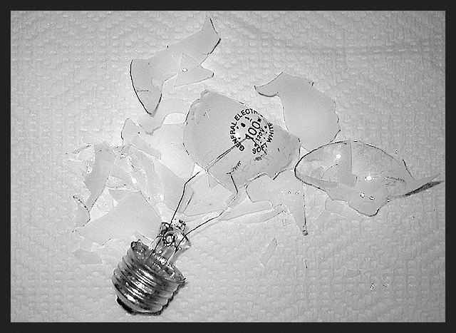
Wow! Reminds me of my current low, low scores on challenges. I guess my "idea bulb" has been "restructured" much like this one. (Hopefully, soon I will have a 5600 K model reinstalled in its place.)
Oh, well, congratulations on a little "light house-keeping." :) Stan |
|
 Photographer found comment helpful. Photographer found comment helpful. |
Comments Made During the Challenge  |
|
|
10/19/2003 02:19:57 AM |
| A really engaging idea here! Composition is nice. Try experimenting with this shot (or a similar one) with sunlight--but in the shade. I think your tones will end up being more pure and natural. |
|
| Photographer found comment helpful. |
|
|
10/16/2003 10:51:07 AM |
| Interesting idea. Two things I'd like to critique on here though. 1) the background is not very image enhancing. I would rather have gone with something without a pattern on it, maybe some photoboard perhaps. This background has a kind of soft feel to it, which is contradictory to a broken light bulb. 2) This image is way oversharpened, a little less USM would have avoided this. |
|
| Photographer found comment helpful. |
|
|
10/14/2003 08:38:35 PM |
| Iighting this from one side or the other, and using a darker background would create some more contrast and visual impact in this photo. |
|
| Photographer found comment helpful. |
|
|
10/14/2003 08:03:47 PM |
| LOVE the idea....not the paper towel. |
|
| Photographer found comment helpful. |
|
|
10/13/2003 09:52:29 PM |
|
| Photographer found comment helpful. |
|
|
10/13/2003 02:12:35 PM |
| Maybe something better then a paper towel This is somewhat bright. |
|
| Photographer found comment helpful. |
|
|
10/13/2003 02:11:40 PM |
| Great Idea!!! But I would have done without the paper-towle! Maybe on an all black background, or solid white background. Great composition and great lighting!!!! 8 |
|
| Photographer found comment helpful. |
|
|
10/13/2003 11:40:40 AM |
| A different color background on this would help the light bulb to stand out more. |
|
| Photographer found comment helpful. |
|
|
10/13/2003 07:41:24 AM |
Good Points: none, sorry
Bad Points:quality os poor, why shoot on a rasied surface? Also not enough balck in the image to warrant a thick balck border.
Score:1 |
|
| Photographer found comment helpful. |
|
|
10/13/2003 06:53:17 AM |
| Appears to be oversharpened, a different colour background would have helped the glass stand out. |
|
| Photographer found comment helpful. |
|
|
10/13/2003 01:15:14 AM |
| I don't care for the paper towel background with this shot at all, also don't care for the thick border...interesting idea though. |
|
| Photographer found comment helpful. |
|
|
10/13/2003 12:41:55 AM |
| a darker surface with less distracting texture than this napkin might have helped to bring out the interesting shapes in the shards of glass |
|
| Photographer found comment helpful. |
Home -
Challenges -
Community -
League -
Photos -
Cameras -
Lenses -
Learn -
Help -
Terms of Use -
Privacy -
Top ^
DPChallenge, and website content and design, Copyright © 2001-2025 Challenging Technologies, LLC.
All digital photo copyrights belong to the photographers and may not be used without permission.
Current Server Time: 03/13/2025 11:18:57 AM EDT.