| Author | Thread |
Comments Made During the Challenge  |
|
|
10/19/2003 12:49:08 PM |
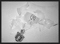
| This definitely exposes things, but as an image it seems to lack clarity - the roots are all surrounded by jagged edges on my screen, as are the lines of the vase, but the marbles at the bottom are cloudy.... Not sure if that is just the image quality, or is more the lighting. |
|
 Photographer found comment helpful. Photographer found comment helpful. |
|
|
10/17/2003 07:45:04 PM |
| I really like the potpourri of colors and shapes, along with the transuscent effect. Beautiful use of light and reflection. |
|
| Photographer found comment helpful. |
|
|
10/16/2003 05:41:01 PM |
| The idea is good but the shot is over sharpened, too bright and the stones in the bottom distract from the roots. I like the background, the way it reverses through the water in the vase and the lighting is good along with the cropping. This one gets a 5 to start |
|
| Photographer found comment helpful. |
|
|
10/16/2003 05:30:32 PM |
| Interesting effect. Nice composition. Wonderful colors |
|
| Photographer found comment helpful. |
|
|
10/14/2003 07:12:56 PM |
| very interesting response to the challenge, unique I believe, but is it a bit oversharpened? |
|
| Photographer found comment helpful. |
|
|
10/14/2003 06:50:20 PM |
| Ugg...the pixelation and the color manipulation of this shot are really bad. Nice idea but not very well executed. |
|
| Photographer found comment helpful. |
|
|
10/14/2003 01:50:13 PM |
| This is an interesting idea but the image seems to be way over sharpened or something... maybe a little too strong on some level adjustmens as well... |
|
| Photographer found comment helpful. |
|
|
10/14/2003 11:44:35 AM |
| Neat idea. Great colors and composition. I think it's a bit oversharpened though. |
|
| Photographer found comment helpful. |
|
|
10/13/2003 11:14:19 PM |
| I love the white/blue dichotomy. Very well done, although it may be a little over-sharpened. |
|
| Photographer found comment helpful. |
|
|
10/13/2003 12:55:54 PM |
| The lighting looks very harsh inside the vase, either that or too much sharpening or contrast added in post editing. Still a bit of soft focus on the roots, but I do like the blue and white background and the colored stones. Definitely fits the challenge. 5 |
|
| Photographer found comment helpful. |
|
|
10/13/2003 12:25:25 PM |
| This was a good idea, the color is also good. The problem is that it looks very over sharpened. I do think it meets the challenge. |
|
| Photographer found comment helpful. |
|
|
10/13/2003 11:44:05 AM |
| This seems rather oversharpened. I like the color choices here a lot. |
|
| Photographer found comment helpful. |
|
|
10/13/2003 09:43:53 AM |
| Looks like very interesting. The only thing I could say against are the white points on the left blue background, but except that, would be 100% |
|
| Photographer found comment helpful. |
|
|
10/13/2003 08:53:53 AM |
| This is way oversharpened. Also I would have cropped off a little more on the right side to keep it all even. |
|
| Photographer found comment helpful. |
|
|
10/13/2003 07:37:08 AM |
Good Points: idea is great and well composed.
Bad Points: image quality is awful, looks oversharp.
Score:5 |
|
| Photographer found comment helpful. |
Home -
Challenges -
Community -
League -
Photos -
Cameras -
Lenses -
Learn -
Help -
Terms of Use -
Privacy -
Top ^
DPChallenge, and website content and design, Copyright © 2001-2025 Challenging Technologies, LLC.
All digital photo copyrights belong to the photographers and may not be used without permission.
Current Server Time: 03/14/2025 06:00:04 AM EDT.