| Author | Thread |
|
|
11/08/2006 10:09:03 AM |
| Excellent shot. Congrats on your high finish! |
|
 Photographer found comment helpful. Photographer found comment helpful. |
|
|
11/06/2006 01:20:49 AM |
| Love it! Congratulations on your top 20 finish. |
|
| Photographer found comment helpful. |
Comments Made During the Challenge  |
|
|
11/05/2006 08:41:40 PM |
| Nice wave crash and great tonal definition. Bump. |
|
| Photographer found comment helpful. |
|
|
11/04/2006 02:08:32 AM |
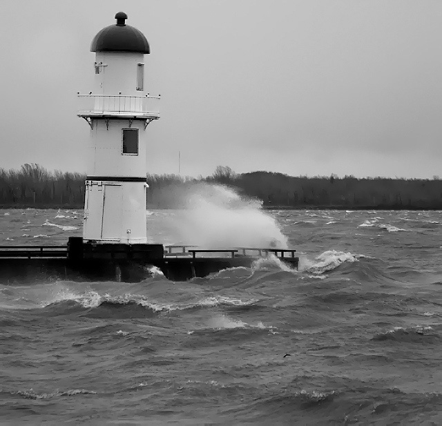
| Nice waves and spray, but please do straighten the light-house! |
|
| Photographer found comment helpful. |
|
|
11/03/2006 09:25:08 PM |
|
| Photographer found comment helpful. |
|
|
11/02/2006 10:11:04 PM |
| The black and white helps convey the stormy feeling this imparts, and the bend of the trees in the distance emphasize the direction of the wind. The water in the foreground has almost a painted look to it which is kinda cool! |
|
| Photographer found comment helpful. |
|
|
11/02/2006 11:25:37 AM |
| The horizon looks level but the lighthouse doesn't...I hate when that happens. I think an average of the two might have helped better (?) or lining up the vertical crop with the lighthouse instead. However, it's a lovely shot and I still think it's good for an 8. |
|
| Photographer found comment helpful. |
|
|
10/31/2006 08:50:36 AM |
|
| Photographer found comment helpful. |
|
|
10/31/2006 05:30:59 AM |
| Now...that is WIND! Great job. |
|
| Photographer found comment helpful. |
|
|
10/30/2006 10:49:27 PM |
|
| Photographer found comment helpful. |
|
|
10/30/2006 10:25:58 PM |
|
| Photographer found comment helpful. |
|
|
10/30/2006 09:09:49 PM |
|
| Photographer found comment helpful. |
|
|
10/30/2006 08:35:25 PM |
| Dramatic image of the wind's power...perfect for this challenge. |
|
| Photographer found comment helpful. |
|
|
10/30/2006 02:13:20 PM |
|
| Photographer found comment helpful. |
|
|
10/30/2006 11:12:25 AM |
| One of the few pictures that really looks like it was taken in the wind, but is it so windy that it's blowing the lighthouse to the right? 8) I like the b&w. Makes it feel like a cold winter day. |
|
| Photographer found comment helpful. |
|
|
10/30/2006 10:54:20 AM |
| it can be a good image, unfortunately is oblique and I think that the building is too much on the top. 5 |
|
| Photographer found comment helpful. |
|
|
10/30/2006 06:59:18 AM |
| I like this effect, and also the black & white tones..... |
|
| Photographer found comment helpful. |
|
|
10/30/2006 05:38:49 AM |
| too much Neat Image, tilt should have been corrected |
|
| Photographer found comment helpful. |
|
|
10/30/2006 01:49:12 AM |
| lot of power there! I just think the horizon needed to be adjusted a smidge...excellent as a b and w |
|
| Photographer found comment helpful. |
Home -
Challenges -
Community -
League -
Photos -
Cameras -
Lenses -
Learn -
Help -
Terms of Use -
Privacy -
Top ^
DPChallenge, and website content and design, Copyright © 2001-2025 Challenging Technologies, LLC.
All digital photo copyrights belong to the photographers and may not be used without permission.
Current Server Time: 03/12/2025 03:04:48 AM EDT.