| Author | Thread |
|
|
03/18/2008 11:48:34 AM |
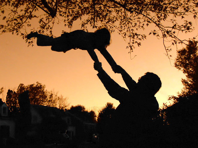
| Wow, I can't beleive the score on this photo. I agree with Claire that the house has a bit too much detail, but the color of the sky is phenominal! |
|
 Photographer found comment helpful. Photographer found comment helpful. |
|
|
12/24/2007 08:15:33 PM |
| Wonderful silhouette! I would like to see the houses in the background silhouetted too though. Great moment. |
|
| Photographer found comment helpful. |
|
|
11/06/2006 04:15:32 PM |
The tree doesn't bother me. I actually like it there with the fine edges on the leaves. I think I would like it with the tree, but if the tree was just a little above the child rather than the feet & head being mixed in with the leaves.
But I would prefer that the entire background (on the ground) be blackened out. The white on the houses shows up a bit and I think would be more effective as a complete sillohuete.
|
|
| Photographer found comment helpful. |
|
|
11/06/2006 03:09:19 PM |
| This is an interesting capture, but I do see why it didn't do well in the challenge. Voters here, for the most part, like to see the challenge met without having to think to much. I can also see why you'd enter it in this challenge. As far as improving it, I agree with the previous posters that wanted to see a cleaner background. Shooting this without that tree in the top of the frame would have improved it tremendously. I'd also like to see the shadows a bit deeper with more of the details lost in darkness. I see that is what you were going for, and making the subjects darker, along with the background elements would make for a much stronger silhouette image. I do like your rule of thirds use, but it also gets lost with the tree cluttering the top pf the frame. Just composing without the tree alone, in my opinion, would have boosted this one well above the 5 mark. I hope this helps. |
|
| Photographer found comment helpful. |
Comments Made During the Challenge  |
|
|
11/04/2006 02:34:46 AM |
|
| Photographer found comment helpful. |
|
|
11/03/2006 08:58:23 PM |
| I wish that the background was cleaner...still good image |
|
| Photographer found comment helpful. |
|
|
11/02/2006 08:46:05 PM |
| Cute idea! The only thing that gets in the way is that the surroundings you've chosen look pretty still considering the situation... I like it though. Might have been nice to see the buildings all black as well. The light sections distract a bit. |
|
| Photographer found comment helpful. |
|
|
10/31/2006 11:13:59 PM |
| A very interesting take on the challenge. I suspect most won't see "wind" here, but I like impression this creates of "wind", whether it be present or not. Very nicely done. |
|
| Photographer found comment helpful. |
|
|
10/31/2006 09:20:49 AM |
| Cute pic, but I'm not really seeing a wind connection here. Sorry. Good luck in the challenge. |
|
| Photographer found comment helpful. |
|
|
10/31/2006 03:43:08 AM |
| nice visual affect. the dark zone at the bottom a wee too wide, imho |
|
| Photographer found comment helpful. |
|
|
10/30/2006 10:17:14 PM |
|
| Photographer found comment helpful. |
|
|
10/30/2006 09:59:19 PM |
|
| Photographer found comment helpful. |
|
|
10/30/2006 07:37:14 PM |
| This is a child's scrapbook entry, for sure. |
|
| Photographer found comment helpful. |
Home -
Challenges -
Community -
League -
Photos -
Cameras -
Lenses -
Learn -
Help -
Terms of Use -
Privacy -
Top ^
DPChallenge, and website content and design, Copyright © 2001-2025 Challenging Technologies, LLC.
All digital photo copyrights belong to the photographers and may not be used without permission.
Current Server Time: 04/26/2025 08:47:35 PM EDT.