| Author | Thread |
Comments Made During the Challenge  |
|
|
10/19/2003 02:22:20 AM |
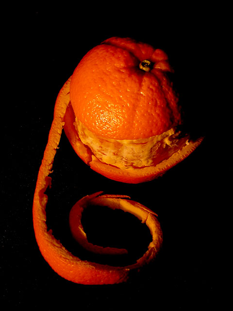
| Very very dark. Did you want such a mysterious mood? I love the composition and the patterns of the peelings. Try this shot outside in the shade on a sunny day to see if you can get more natural tones and colors. |
|
 Photographer found comment helpful. Photographer found comment helpful. |
|
|
10/15/2003 08:44:55 PM |
| This is a great concept, exposing the orange and I love the way you peeled it, very inventive! The only thing is the color of the orange, it seems a bit dark to me. The lighting is wonderful the shadow on the right is very apeeling, :) I'm giving this one an 8 for now but I'll be back. |
|
| Photographer found comment helpful. |
|
|
10/14/2003 07:34:16 PM |
| While I think this photo meets the challenge very well and I love the idea I think the lighting should have been brighter. It is too dark in my opinion. |
|
| Photographer found comment helpful. |
|
|
10/14/2003 07:32:25 PM |
| I have come to this image a few times and can't put my finger on why I don't like it. I think it's a combination of the color cast and the lack of 'surface' that makes it appear to be floating in space. |
|
| Photographer found comment helpful. |
|
|
10/14/2003 12:03:32 PM |
| ooh this is pretty and cool |
|
| Photographer found comment helpful. |
|
|
10/13/2003 09:48:21 PM |
|
| Photographer found comment helpful. |
|
|
10/13/2003 03:20:08 PM |
| I like the idea, but somehow the lusciousness of the inside of the orange doesn't come through. I think removing the white under peel would make for a more attractive photo, and possbly a little less contrast. |
|
| Photographer found comment helpful. |
|
|
10/13/2003 02:16:31 PM |
| I like the idea and the composition is okay. But the contarst seems too harsh, and the color a bit too orange. |
|
| Photographer found comment helpful. |
|
|
10/13/2003 12:45:13 PM |
| nice composition, the overall darkness is a bit too much |
|
| Photographer found comment helpful. |
|
|
10/13/2003 11:24:40 AM |
| Winning idea, spot on for the challenge. I think this falls short because of the poor lighting. The pith is white and should look less orange. I understand the dilemma. I think the composition is very nice. |
|
| Photographer found comment helpful. |
|
|
10/13/2003 09:40:38 AM |
| Very good picture. I like the colors. Simple but that's why it's specially great! |
|
| Photographer found comment helpful. |
|
|
10/13/2003 09:33:55 AM |
| I like the idea and the composition, but it seems too dark overall. |
|
| Photographer found comment helpful. |
|
|
10/13/2003 05:35:19 AM |
Good points:like the way the orange is placed
Bad points:too much orange(color to saturated) slightly oof
Score:4 |
|
| Photographer found comment helpful. |
Home -
Challenges -
Community -
League -
Photos -
Cameras -
Lenses -
Learn -
Help -
Terms of Use -
Privacy -
Top ^
DPChallenge, and website content and design, Copyright © 2001-2025 Challenging Technologies, LLC.
All digital photo copyrights belong to the photographers and may not be used without permission.
Current Server Time: 03/14/2025 11:45:03 AM EDT.