| Author | Thread |
Comments Made During the Challenge  |
|
|
11/06/2006 03:07:51 PM |
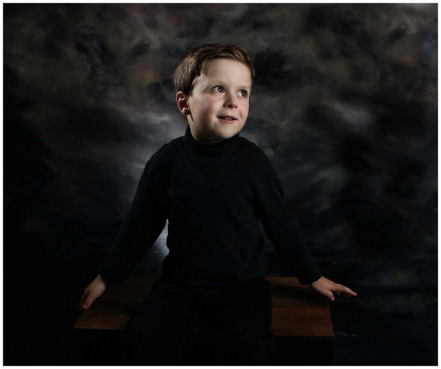
| a little too dark, I think. |
|
|
|
11/06/2006 01:56:38 PM |
| I like the tone and feel of this overall. Jury's still out on the centered composition and the angle of his face. It's unique as a portrait from most of the others in the challenge. On this monitor (not a good one) I'm losing some detail in the black of his shirt and pants. Sorry about riding the fence on this one...it's "ok", not loving it, nor really disliking it. :D Good luck in the challenge. |
|
|
|
11/06/2006 01:31:22 AM |
| Actually this is really stunning and you have done an amazing portrait of Zachary..... I love this one..... |
|
|
|
11/04/2006 05:51:23 AM |
| What a sweet face, nice setup and light, the dark clothes make for a poor contrast, don't know if a crop of shoulders up would have been better...really nice portrait though |
|
|
|
11/03/2006 09:23:37 PM |
| great use of light. awesome portrait |
|
|
|
11/03/2006 05:56:25 PM |
| I found a lot of more interesting photos but, I can really appreciate the professional quality of it. I'm giving it an 8 but predict it will finish in the top 10. |
|
|
|
11/01/2006 05:48:45 PM |
| I think this wouldhave been better off-center, with more negative space to the right for him to "look into". I like your low-key here. Well lit. I know it is hard to pose the little guys, but I think his hands spread apart like that are distracting, becuase they are a little 'disembodied' with the black shirt. |
|
|
|
11/01/2006 12:33:09 PM |
| I like the contrast, lighting and pose. However, I am not sure what the Landscape format gives you but dead space... |
|
|
|
11/01/2006 01:56:03 AM |
| The head came out quite well, but I wish you didn't lose most detail in the black closing - the body looks flat. |
|
Home -
Challenges -
Community -
League -
Photos -
Cameras -
Lenses -
Learn -
Help -
Terms of Use -
Privacy -
Top ^
DPChallenge, and website content and design, Copyright © 2001-2025 Challenging Technologies, LLC.
All digital photo copyrights belong to the photographers and may not be used without permission.
Current Server Time: 03/12/2025 11:26:00 AM EDT.