| Author | Thread |
Comments Made During the Challenge  |
|
|
11/21/2006 04:30:18 PM |
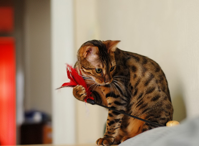
| I would have cropped much more tightly from the left. |
|
 Photographer found comment helpful. Photographer found comment helpful. |
|
|
11/20/2006 08:51:19 PM |
| The lighting on the cat is beautiful. I think the red strip and background detract a bit. A bigger crop might help. |
|
| Photographer found comment helpful. |
|
|
11/20/2006 07:07:54 PM |
| The photo is a little blurry and I find the right corner distracting. I know cat shots get hit hard around here. Maybe try playing with the cat in an area without distracting elements and get a tighter crop. Maybe try playing with the toy just off camera to try and get a shot of the cat looking interested with out seeing the toy. Just my opinion, I hope you found it somewhat helpful |
|
| Photographer found comment helpful. |
|
|
11/19/2006 07:17:02 PM |
| Lol. Now, this is a cooperative subject to allow such a nice capture. |
|
| Photographer found comment helpful. |
|
|
11/19/2006 04:56:35 PM |
| The white object in the bottom right corner distracts me a bit. The photo as a whole seems a touch blurry, but it's still by far one of the best shots of the challenge. Love the colors. Beautiful cat. |
|
| Photographer found comment helpful. |
|
|
11/19/2006 07:55:52 AM |
|
| Photographer found comment helpful. |
|
|
11/18/2006 06:44:07 PM |
| That cat definately has spots. |
|
| Photographer found comment helpful. |
|
|
11/17/2006 10:57:38 AM |
| That is one cool looking cat! A little faster shutter speed would have froze the cat's paw and whiskers (which are a little blurred). Very good color and focus on the body and legs of the cat. The red door/cabinet in the background pulls the viewers attention away unneedlessly and probably should have been cropped out. All JMO of course. Good luck in the challenge. |
|
| Photographer found comment helpful. |
|
|
11/16/2006 09:22:49 PM |
| tighter crop maybe. the red window in the back ground is distracting from the cute kitty. |
|
| Photographer found comment helpful. |
|
|
11/16/2006 07:14:00 AM |
| Lovely cat and portriat of it, but sure has lots of unnecessary "dead" space -- needs to be cropped much tighter. |
|
| Photographer found comment helpful. |
|
|
11/16/2006 03:07:27 AM |
| Nice but looks slightly saturated. Also I think tight cropping may have worked better. |
|
| Photographer found comment helpful. |
|
|
11/15/2006 02:34:54 PM |
| I would like this better with the black and orange from the other room cropped out. |
|
| Photographer found comment helpful. |
|
|
11/15/2006 01:23:04 PM |
|
| Photographer found comment helpful. |
|
|
11/15/2006 08:21:35 AM |
| looks a lot like the cat I submitted! |
|
| Photographer found comment helpful. |
Home -
Challenges -
Community -
League -
Photos -
Cameras -
Lenses -
Learn -
Help -
Terms of Use -
Privacy -
Top ^
DPChallenge, and website content and design, Copyright © 2001-2025 Challenging Technologies, LLC.
All digital photo copyrights belong to the photographers and may not be used without permission.
Current Server Time: 03/12/2025 08:08:40 AM EDT.