| Author | Thread |
|
|
11/23/2006 07:09:29 PM |
| Ah, so that was yours. Although it is a bit of a cliche subject-wise around here, I thought that your execution was far richer and more relaxed than any of the other renditions I've seen. I think it was the relaxed style in it which attracts. |
|
 Photographer found comment helpful. Photographer found comment helpful. |
|
|
11/23/2006 04:32:15 PM |
| Very good picture. Congrats on your top 20 finish! |
|
| Photographer found comment helpful. |
|
|
11/22/2006 02:04:49 AM |
| Congratulations on your top twenty finish. Very nice presentation. |
|
| Photographer found comment helpful. |
Comments Made During the Challenge  |
|
|
11/20/2006 09:30:38 PM |
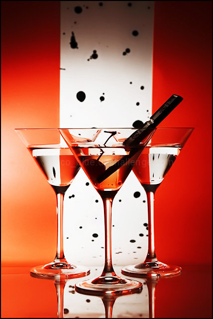
| Too cool. Great refraction (I think that's the right term) and DOF. |
|
| Photographer found comment helpful. |
|
|
11/20/2006 06:58:06 PM |
| its been a while since I have seen this type shot, I like the twist that you added and the red black and white really work well together. |
|
| Photographer found comment helpful. |
|
|
11/20/2006 11:47:17 AM |
| Very nice picture that is similiar to some tutorials on this site. Very nicely done, but originality is a big part of scoring for me. I love the use of lighting, color, and the overall look of this image. If I hadn't seen the concept before I'd give it a top score. |
|
| Photographer found comment helpful. |
|
|
11/19/2006 05:05:13 PM |
| Your white stripe tilts to the right a bit. It also looks like it's separating from the background? It looks like there's a shadow on the top left of the white paper. With that all said, I doubt anyone will notice! Nice job. |
|
| Photographer found comment helpful. |
|
|
11/19/2006 04:03:03 PM |
| I had martini to sell, I would give you a call, very nice presentation! 8 |
|
| Photographer found comment helpful. |
|
|
11/19/2006 02:52:56 PM |
| very pro/stock looking shot. loved the title. |
|
| Photographer found comment helpful. |
|
|
11/18/2006 11:45:03 PM |
0-3 met challenge = 2
0-2 creativity = 1
0-3 Lighting/Comp = 3
0-2 Viewer Appeal = 1
My Vote = 7
Nicely done! |
|
| Photographer found comment helpful. |
|
|
11/18/2006 06:39:07 PM |
|
| Photographer found comment helpful. |
|
|
11/17/2006 01:44:23 PM |
| Elegant, nice colours and design. 8. |
|
| Photographer found comment helpful. |
|
|
11/16/2006 05:37:37 PM |
| I love it!!! 10 and a fave |
|
| Photographer found comment helpful. |
|
|
11/16/2006 01:03:47 PM |
| Nice job!! the reflection is great and you background is also nice. I would have left the black prop in the glass out it takes away too much, pulling the focus to it instead JMO. |
|
| Photographer found comment helpful. |
|
|
11/16/2006 12:51:29 PM |
| i just love the color of the background and the focus on the glasses |
|
| Photographer found comment helpful. |
|
|
11/16/2006 04:23:16 AM |
|
| Photographer found comment helpful. |
|
|
11/15/2006 06:39:37 PM |
| Looks like this one was a lot or work to get everything positioned and lit properly. Very nice job. |
|
| Photographer found comment helpful. |
|
|
11/15/2006 01:18:02 PM |
| Clever idea! Probably could have done without whatever that black object is in the drink. Something also doesn't quite line up with the backdrop (white) material - it's making the photo appear to lean to the right. Nonetheless, you should do well with this. Good luck. |
|
| Photographer found comment helpful. |
|
|
11/15/2006 12:26:22 AM |
Nico blue, I've caught you!
I saw your submission on deviantART. It's nice anyway. :P |
|
| Photographer found comment helpful. |
Home -
Challenges -
Community -
League -
Photos -
Cameras -
Lenses -
Learn -
Help -
Terms of Use -
Privacy -
Top ^
DPChallenge, and website content and design, Copyright © 2001-2025 Challenging Technologies, LLC.
All digital photo copyrights belong to the photographers and may not be used without permission.
Current Server Time: 03/12/2025 12:19:50 PM EDT.