| Author | Thread |
|
|
08/11/2007 11:37:57 AM |
|
 Photographer found comment helpful. Photographer found comment helpful. |
Comments Made During the Challenge  |
|
|
11/26/2006 06:41:32 PM |
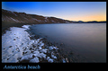
| Is that the sea sloping, or is it your camera... ?! nice colours and place, though! Nice sentiment. |
|
| Photographer found comment helpful. |
|
|
11/25/2006 06:39:33 PM |
| Beautiful as this is the layout that allows as much type as one to insert. A gallery like presentation. Bump. |
|
| Photographer found comment helpful. |
|
|
11/25/2006 04:56:35 PM |
|
| Photographer found comment helpful. |
|
|
11/24/2006 10:51:35 PM |
| Nice colors. Subtitle seems wordy and too distracting, at least strike "unimportant," or how about "Treasure each day by noticing the wonder of it all." |
|
| Photographer found comment helpful. |
|
|
11/24/2006 04:02:14 PM |
|
| Photographer found comment helpful. |
|
|
11/23/2006 06:43:09 AM |
| Beautiful shot. Beautiful sentiment. |
|
| Photographer found comment helpful. |
|
|
11/21/2006 11:35:57 PM |
|
| Photographer found comment helpful. |
|
|
11/21/2006 11:18:30 PM |
| Very nice, but I would have liked it with a level sea and sky ... |
|
| Photographer found comment helpful. |
|
|
11/21/2006 08:53:59 PM |
| The photo is wonderful - but there is by far way to much text. Welcome to the Coast would have been enough. |
|
| Photographer found comment helpful. |
|
|
11/21/2006 08:47:56 PM |
| Beautiful shot... looks very relaxing and peaceful. My eye is drawn to the text at the bottom though, which is a bit wordy for such a serene and quiet place. |
|
|
|
11/21/2006 06:38:16 PM |
|
| Photographer found comment helpful. |
|
|
11/21/2006 05:41:22 PM |
| It's a pretty view and the graphic presentation is pleasant enough. 9. |
|
| Photographer found comment helpful. |
|
|
11/21/2006 12:23:49 AM |
| The photo is lovely and speaks for itself. Super light and colors. A bit too much verbiage, perhaps. Nice work, though. |
|
| Photographer found comment helpful. |
|
|
11/20/2006 05:30:24 PM |
| this is a little too close to a square for a postcard. the image looks great, i especially like how the rocks add interest to the foreground. the horizon does seem a little crooked, though. |
|
| Photographer found comment helpful. |
|
|
11/20/2006 03:17:00 PM |
| Almost a bit too wordy I think. It takes away from the photo IMO. First impression is this reminds me a little of those motivational poster/prints you see, which is a compliment I think. :D Pleasing image. I like how you've included the foreground rocks. The background hill and shoreline aid the viewer with a nice set of leading lines. Overall, quite nice. Good luck in the challenge. |
|
| Photographer found comment helpful. |
|
|
11/20/2006 12:14:52 PM |
| I would have preferred this without the 'motivational', but I do still think it good. |
|
| Photographer found comment helpful. |
|
|
11/20/2006 10:27:22 AM |
| A bit too much wording, INMO, but a great shot nonetheless |
|
| Photographer found comment helpful. |
|
|
11/20/2006 05:56:14 AM |
|
| Photographer found comment helpful. |
|
|
11/20/2006 04:24:44 AM |
|
| Photographer found comment helpful. |
|
|
11/20/2006 12:27:57 AM |
|
| Photographer found comment helpful. |
Home -
Challenges -
Community -
League -
Photos -
Cameras -
Lenses -
Learn -
Help -
Terms of Use -
Privacy -
Top ^
DPChallenge, and website content and design, Copyright © 2001-2025 Challenging Technologies, LLC.
All digital photo copyrights belong to the photographers and may not be used without permission.
Current Server Time: 03/12/2025 02:58:21 AM EDT.