| Author | Thread |
Comments Made During the Challenge  |
|
|
11/26/2006 01:53:46 AM |
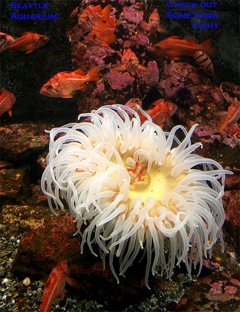
| The photo is spectacular. I'm afraid the text is underwhelming. I'm going to vote on the photo only :) |
|
 Photographer found comment helpful. Photographer found comment helpful. |
|
|
11/25/2006 06:11:28 PM |
| Thats an awesome aquarium shot, I would have left the text off. It just does not fit real well. But I love the anenome, they are so cool. |
|
| Photographer found comment helpful. |
|
|
11/25/2006 04:50:58 PM |
| aboslutely gorgeous sponge and red fish - all are very clear and in focus. |
|
| Photographer found comment helpful. |
|
|
11/25/2006 02:33:20 PM |
|
| Photographer found comment helpful. |
|
|
11/23/2006 06:01:37 PM |
| Good capture, text needs working on. |
|
| Photographer found comment helpful. |
|
|
11/22/2006 08:02:09 PM |
|
| Photographer found comment helpful. |
|
|
11/21/2006 10:00:20 PM |
| the color is very nice but the font of the text do not seem appropriate for a postcard |
|
| Photographer found comment helpful. |
|
|
11/21/2006 09:21:58 PM |
| Please submit your original to www.ppchallenge.com . Looks like a great image to work with! :) |
|
| Photographer found comment helpful. |
|
|
11/21/2006 05:52:36 PM |
| Great shot, but I feel like the font is too square and boldly colored, and doesn't seem to go with the flowing water and tentacles of the sea creature. |
|
| Photographer found comment helpful. |
|
|
11/20/2006 10:30:53 PM |
| Love the image...but the text, while witty is hard to read. |
|
| Photographer found comment helpful. |
|
|
11/20/2006 10:16:13 PM |
| This would look better if the text was more interesting. |
|
| Photographer found comment helpful. |
|
|
11/20/2006 05:05:55 PM |
|
| Photographer found comment helpful. |
|
|
11/20/2006 01:32:09 PM |
| Very nice! One tiny thing I'd change -- I'd move the text on the right a little more to the right, so the margin will match the text on the left. |
|
| Photographer found comment helpful. |
|
|
11/20/2006 09:40:41 AM |
| The picture itself is a 10. I don't think the blue chosen for the text was the right choice. Not sure what color would have worked best, but the blue feels really out of place in my opinion and is a distraction. I think just going with the simple Seattle Aquarium title would have worked and maybe choose the same yellow from the center of the anema (sp). Score: 9. |
|
| Photographer found comment helpful. |
Home -
Challenges -
Community -
League -
Photos -
Cameras -
Lenses -
Learn -
Help -
Terms of Use -
Privacy -
Top ^
DPChallenge, and website content and design, Copyright © 2001-2025 Challenging Technologies, LLC.
All digital photo copyrights belong to the photographers and may not be used without permission.
Current Server Time: 04/01/2025 06:59:08 PM EDT.