| Author | Thread |
|
|
12/03/2006 03:07:18 PM |
Greetings from the Critique Club
I'll briefly talk about the technical stuff, since, based on your own comments and those you got during the challenge, you know the major problem is with sharpness.
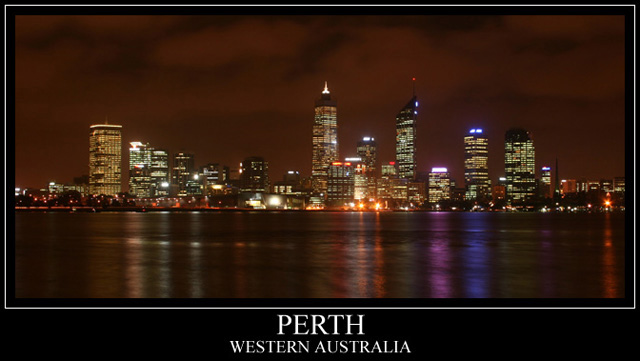
I love the sky in this shot, too many people, when doing a cityscape like this make the sky black and the edges of the buildings get lost. Here, the overcast sky and the city's glow combine to give a surreal orange look to the sky.
From an aesthetic point of view, my eye is immediately drawn to the right half of the image, due to the pink and purple reflections on the water there and the fact that the reflections are more intense on the right side. The left half just isn't as interesting to me. If anything, you might try cropping most of the right half entirely.
The only other thing I might suggest would be to try HDR or something to expand your contrast range and keep the lights on the buildings from being blown out. It's just something to consider trying.
Message edited by author 2006-12-03 15:14:31. |
|
|
|
11/27/2006 06:40:38 AM |
WOW!!!!
I can't believe this photo did so well:) thank you all for your comments and suggestions. This is my very first chellange result. I seriously didnt expect this photo would end up in the first top 100:)
I'm pumped, inspired and wanting to learn more:)
Thanks heaps again!!
mike |
|
Comments Made During the Challenge  |
|
|
11/24/2006 03:09:50 PM |
| A touch of sharpening and this would really pop! Nice choice for a card. |
|
|
|
11/24/2006 07:32:02 AM |
Does that mean it's not isolated during the day?
And, of course, it's a state capital. |
|
|
|
11/24/2006 01:36:37 AM |
| Part of the visual interest for me in a cityscape like this is the individual shapes and patterns, and blurriness reduces that. |
|
|
|
11/23/2006 06:29:09 AM |
| Very pretty but seems a little out of focus. |
|
|
|
11/23/2006 03:36:22 AM |
| Wonderful, and I do hope this does well, as both Peter and I love Perth, Western Australia. |
|
|
|
11/22/2006 08:55:52 PM |
| very nice! love the coloring.... |
|
|
|
11/22/2006 03:26:56 PM |
| Nice panorama. Good complementary graphic design too. |
|
|
|
11/22/2006 07:23:12 AM |
|
|
|
11/21/2006 11:34:01 PM |
| might be isolated but still a great place 7 |
|
|
|
11/20/2006 09:27:24 PM |
| Ever been to Juneau AK? Very nice image. - 7 |
|
|
|
11/20/2006 06:01:45 PM |
| Great image - looks like a postcard straight off the rack. Nicely done. <9> |
|
|
|
11/20/2006 09:00:48 AM |
| Better as a print above my desk in the office than as a postcard. But is really good. |
|
|
|
11/20/2006 04:53:32 AM |
| just a little on the soft side...nice as a postcard though my fellow aussie |
|
|
|
11/20/2006 12:58:52 AM |
| Australia day 1998 I saw the best fireworks show in my life from the view in this photo (or close by). This is an awesome capture. I love the pink and blue reflection on the right. Nothing seems too blown out to me and the focus looks good. I might have put the wording all on the same line instead of two lines so that there isn't so much black space on each side but it also works the way it is. It isn't distracting or anything. Overall I like this photo. 8 for now but my first vote in this challenge. I may bump it up. |
|
Home -
Challenges -
Community -
League -
Photos -
Cameras -
Lenses -
Learn -
Help -
Terms of Use -
Privacy -
Top ^
DPChallenge, and website content and design, Copyright © 2001-2025 Challenging Technologies, LLC.
All digital photo copyrights belong to the photographers and may not be used without permission.
Current Server Time: 03/12/2025 02:57:43 AM EDT.