| Author | Thread |
|
|
11/27/2006 01:23:20 AM |
| This was actually my fav :) Should have scored higher! Congrats on the nice entry :D |
|
 Photographer found comment helpful. Photographer found comment helpful. |
Comments Made During the Challenge  |
|
|
11/26/2006 11:45:49 PM |
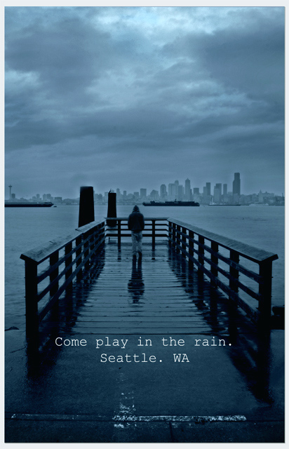
| Yay! Somebody else used Courier. You see, there used to be this thing called a typewriter, and gritty cities like Seattle had, like, writers and, like, journalists, and stuff, and so a typewriter font conveys grittiness... I feel your pain. 9 |
|
| Photographer found comment helpful. |
|
|
11/26/2006 10:42:35 PM |
| My pick in this challenge. This would make an awesome poster/print (and it might find a home in my office). Terrific lighting/mood. Normally the barges ruin the shots from Alkai... but they actually HELP in this scene. Well done! |
|
| Photographer found comment helpful. |
|
|
11/26/2006 06:01:57 PM |
|
| Photographer found comment helpful. |
|
|
11/26/2006 01:05:25 AM |
|
|
|
11/25/2006 02:24:03 PM |
|
| Photographer found comment helpful. |
|
|
11/25/2006 11:30:14 AM |
| VERY creative. I really like this. |
|
| Photographer found comment helpful. |
|
|
11/25/2006 01:24:14 AM |
| This doesn't seem very inviting for a postcard, but its a good photo. I would have placed the lettering differently. I think it is distracting. |
|
| Photographer found comment helpful. |
|
|
11/22/2006 03:53:10 PM |
| Nicely reinforces the Seattle reputation. You could find a better font. And I'd place it where it didn't block the entrance to the dock. Actually it blocks the entrance to the whole photo. |
|
| Photographer found comment helpful. |
|
|
11/21/2006 05:39:24 PM |
| This is a nice shot, I like the way the pier leads out with the skyline in the background. The blue tones are nice too, and help give the feel of a dreary day. Unfortunately, I would have rather seen this in something like a "rain" challenge. It just seems so sad and depressing, and makes me want to stay away from Seattle. The text also seems just thrown on. I think I might have liked to see it lower to the bottom of the postcard, and a different font. |
|
|
|
11/21/2006 02:56:14 PM |
| A nice idea and execution. One suggestion: IMHO, a crop right below the text would have been an improvment. |
|
| Photographer found comment helpful. |
|
|
11/21/2006 09:31:01 AM |
| great color, dof, and over all feel. Exellent. |
|
| Photographer found comment helpful. |
|
|
11/21/2006 01:12:45 AM |
| Would make a great poster. |
|
| Photographer found comment helpful. |
|
|
11/20/2006 11:05:33 PM |
| I can SO relate to that *sigh* |
|
| Photographer found comment helpful. |
|
|
11/20/2006 05:12:27 PM |
| This is awesome. It just captures the essence of Seattle :-) 8. |
|
| Photographer found comment helpful. |
|
|
11/20/2006 03:16:11 PM |
| I love this idea, but I think the horizontal band of light reflecting at the bottom is distracting. Maybe crop a bit higher and bring down the words a bit? |
|
| Photographer found comment helpful. |
|
|
11/20/2006 10:25:09 AM |
|
| Photographer found comment helpful. |
|
|
11/20/2006 09:46:30 AM |
| LOL, what a good idea. Font matches perfectly. |
|
| Photographer found comment helpful. |
|
|
11/20/2006 05:20:31 AM |
|
| Photographer found comment helpful. |
|
|
11/20/2006 04:50:03 AM |
| wonderful ...love the blue and the idea |
|
| Photographer found comment helpful. |
|
|
11/20/2006 12:20:50 AM |
| I really like this. Great blue tones. Not wild about the font, but no marks taken for that. |
|
| Photographer found comment helpful. |
Home -
Challenges -
Community -
League -
Photos -
Cameras -
Lenses -
Learn -
Help -
Terms of Use -
Privacy -
Top ^
DPChallenge, and website content and design, Copyright © 2001-2025 Challenging Technologies, LLC.
All digital photo copyrights belong to the photographers and may not be used without permission.
Current Server Time: 03/13/2025 04:57:18 AM EDT.