| Author | Thread |
|
|
11/28/2006 09:10:36 AM |
| Great shot Tom, I have to agree with the choice of fonts (not my cup of tea) but this doen't distract from the quality of the image - Great work |
|
 Photographer found comment helpful. Photographer found comment helpful. |
Comments Made During the Challenge  |
|
|
11/23/2006 12:46:23 PM |
| Like the picture, but your choice of font is distracting |
|
| Photographer found comment helpful. |
|
|
11/23/2006 02:17:29 AM |
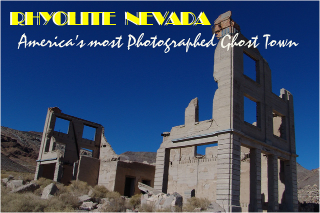
| This is very well done. I do think that it might be a bit better if the text didn't go over the top of the building but kept to the left side. |
|
| Photographer found comment helpful. |
|
|
11/21/2006 12:30:52 AM |
| Been there, done that, well done, composition is great |
|
| Photographer found comment helpful. |
|
|
11/20/2006 05:31:43 PM |
| I like the perspective and lighting. The bright yellow font doesn't work for me. |
|
| Photographer found comment helpful. |
|
|
11/20/2006 01:55:13 PM |
|
|
|
11/20/2006 01:25:39 PM |
| Very nice card! I'd like to go there, and if I did, I'd buy this card. |
|
| Photographer found comment helpful. |
Home -
Challenges -
Community -
League -
Photos -
Cameras -
Lenses -
Learn -
Help -
Terms of Use -
Privacy -
Top ^
DPChallenge, and website content and design, Copyright © 2001-2025 Challenging Technologies, LLC.
All digital photo copyrights belong to the photographers and may not be used without permission.
Current Server Time: 03/12/2025 08:33:11 PM EDT.