| Author | Thread |
Comments Made During the Challenge  |
|
|
11/26/2006 06:37:49 PM |
| The gap would look great with text! |
|
|
|
11/25/2006 07:54:07 PM |
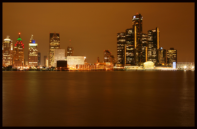
| too much water. and too brown. |
|
|
|
11/25/2006 01:37:44 AM |
| Lovely colors. This would be even better if you had employed the rule of thirds. |
|
|
|
11/24/2006 01:39:24 AM |
| Using half of the shot for the smooth water gives up a lot of visual interest, at least for me. |
|
|
|
11/21/2006 08:45:08 PM |
| All of that negative space in the water is just screaming for some text! I'm not sure I like the horizon right through the center, but with text added at the bottom, it might work. |
|
|
|
11/21/2006 08:28:33 PM |
| My oncly concern is that the horizon is right in the middle and the water in front does not add much to the really nice cityscape |
|
|
|
11/21/2006 03:39:45 PM |
| Too much empty foreground - perhaps you could have utilised some of it to write a caption. |
|
|
|
11/21/2006 02:46:41 PM |
| The refections are a bit too weak to make this work IMHO, with just a boring area of brown at the bottom. The building to the left also looks a bit chopped off, so the composition isn't spot on in that respect either. On the good side, it's nicely exposed with no burn outs, so good job there! |
|
|
|
11/21/2006 03:31:25 AM |
| too much of the water to be seen here - you could have filled that space with the citiy's name to balance the composition |
|
|
|
11/21/2006 12:31:56 AM |
| the constant coloration does well in this, good work |
|
|
|
11/20/2006 08:06:34 PM |
|
|
|
11/20/2006 04:56:00 PM |
| A pano would have been gorgeous here. I don't think you could have done that within the rules, unless you did some serious cropping. As is, there is just a little too much water. But I certainly like the colors. You should have taken advantage of the special rule, and added some text to let us know what city this is. |
|
|
|
11/20/2006 12:36:23 PM |
| This photo seems a little fuzzy. When I do long expose photos I manually set the focus on 'infinity' and that tends to get a clearer photo. |
|
|
|
11/20/2006 10:08:59 AM |
| A cool cityscape! I might have added text in the water area since text is allowed in this challenge. As it is, it seems like the shot is a little too evenly divided in half. I probably would have cropped it so that there was less water and more sky, or fill the water with appropriate text. |
|
|
|
11/20/2006 10:00:16 AM |
| nice, where is this ? pity that there is no text, i will not vote it down :-) |
|
Home -
Challenges -
Community -
League -
Photos -
Cameras -
Lenses -
Learn -
Help -
Terms of Use -
Privacy -
Top ^
DPChallenge, and website content and design, Copyright © 2001-2025 Challenging Technologies, LLC.
All digital photo copyrights belong to the photographers and may not be used without permission.
Current Server Time: 03/12/2025 03:15:59 PM EDT.