| Author | Thread |
Comments Made During the Challenge  |
|
|
08/18/2002 05:12:00 PM |
| I think that this would have been much better in color |
|
|
|
08/18/2002 11:37:00 AM |
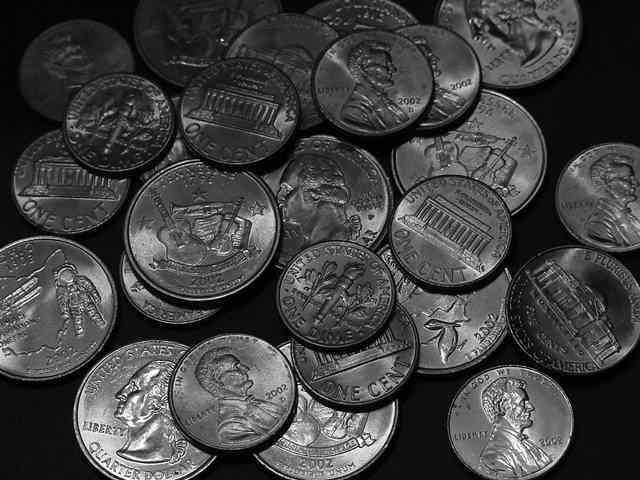
| At first glance, I got a few different ideas. First, I thought. Woohoo, coins. Then as I sat here looking at it, I saw they are all 2002, so that is definately depicting newness. Then I thought, why is it in black and white? I realized that it could have been to further convey the newness look due to the fact that the black and white hides small scratches and slight discoloration. However, I would also like to see this done in color. If the b&w was to hide some discoloration of the coins, here is a trick. If you wash money in ketchup (sounds really sick, but it works) the acid in the ketchup kind of acts as a heavy duty cleaner and really puts a shine in the money. Just put a dab on and rub it between your fingers until nice and shiny. There was nothing more cool to me when I was young as putting really shiny coins in my piggy bank, so that's how I know about that. Anyway, great photo and good luck with the challenge. |
|
|
|
08/16/2002 11:35:00 PM |
| Very dark and lighting is quite different from what is visually appealing to me. |
|
|
|
08/15/2002 01:07:00 PM |
| This is a bit too dark for my taste. I'm not sure I like the use of b&w here. |
|
|
|
08/14/2002 09:21:00 PM |
| Ok, I was originally going to rate this low for not being able to establish a clear connection but after someone pointed out the dates on the coins to me the score has jumped. Certainly meets the challenge, and I like the lighting on the coins. One suggestion I would make is to make a few of the coins more obvious that they are of new vintage. |
|
|
|
08/14/2002 07:10:00 PM |
| New coins, thanks for not pointing out the obvious. I would bet you were trying to avoid flaring on the coins, but in my opinion, you netted a bit of a dark image. Focus is really nice, most all the way back, but coins start disappearing towards the back for the darkness. Could this be on purpose? yes, but I don't know either way, so I wrote it up. I like the fact that you show both sides of these coins, it looks "scattered", but seems purposeful, nice. All my jokes for you got backspaced as non-functional, lucky you. 7 Swash |
|
|
|
08/14/2002 09:47:00 AM |
| a touch brighter would hlep |
|
|
|
08/13/2002 11:38:00 PM |
| i had this idea too. i am glad i did not submit - yours would have been better! |
|
|
|
08/13/2002 01:32:00 PM |
| Too dark and not clear enough. |
|
|
|
08/12/2002 11:31:00 PM |
Composition6
Technical Aspects6
Appeal6
Creativity5
Rating6Autool
|
|
|
|
08/12/2002 06:25:00 PM |
| I would have liked to see this in color. The black and white takes away from the "new" I think. |
|
|
|
08/12/2002 05:18:00 PM |
| I'm sure you and many others think this actually fits the challenge, but I don't think so. |
|
|
|
08/12/2002 12:19:00 PM |
| interesting.....when did the Ohio quarter come out? ha |
|
|
|
08/12/2002 04:09:00 AM |
|
|
|
08/12/2002 03:15:00 AM |
| The colors of the coins might have been better showing the contrasts. This way it is sort of "flat.". The arrangement is good and the clarity of the focus. Color would have made this sort of "jump" out. |
|
|
|
08/12/2002 12:42:00 AM |
| I really like the concept of the 'new' coins in this photo. I think that was an excellent choice for this challenge. In this particular image, I think that color would have been a better choice than black and white, because black and white photos are not generally associated with anything 'new'. B/W, in most cases, gives the photo more of a sense of old. That, coupled with the darkness in this image, doesn't really push the NEW coins into the spotlight :) - jmsetzler |
|
Home -
Challenges -
Community -
League -
Photos -
Cameras -
Lenses -
Learn -
Help -
Terms of Use -
Privacy -
Top ^
DPChallenge, and website content and design, Copyright © 2001-2025 Challenging Technologies, LLC.
All digital photo copyrights belong to the photographers and may not be used without permission.
Current Server Time: 03/12/2025 07:35:56 PM EDT.