| Author | Thread |
|
|
11/28/2006 09:07:38 AM |
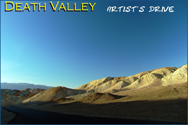
| I love this Sandi, the contrast between shadow and blazing sun is great and really adds to the desolate feel of Death Valley |
|
 Photographer found comment helpful. Photographer found comment helpful. |
Comments Made During the Challenge  |
|
|
11/26/2006 03:26:38 AM |
| The shadow in the foreground is too dark. I know that's probably what it looks like, but this might have been a good opportunity to use tone mapping to bring out more details. |
|
| Photographer found comment helpful. |
|
|
11/23/2006 07:59:44 PM |
|
| Photographer found comment helpful. |
|
|
11/21/2006 09:15:24 PM |
| The two styles of font look awkward - the photo is very nice - a little too much dark in teh foreground however |
|
| Photographer found comment helpful. |
|
|
11/20/2006 05:36:39 PM |
| Land looks a bit overexposed to me. |
|
| Photographer found comment helpful. |
|
|
11/20/2006 03:08:28 AM |
| really wonderful, the huge text does not do it justice though. |
|
| Photographer found comment helpful. |
Home -
Challenges -
Community -
League -
Photos -
Cameras -
Lenses -
Learn -
Help -
Terms of Use -
Privacy -
Top ^
DPChallenge, and website content and design, Copyright © 2001-2025 Challenging Technologies, LLC.
All digital photo copyrights belong to the photographers and may not be used without permission.
Current Server Time: 03/16/2025 11:14:55 PM EDT.