| Author | Thread |
Comments Made During the Challenge  |
|
|
11/26/2006 03:46:27 AM |
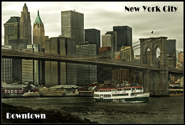
| Like the desat. Reminds me of an old postcard. |
|
 Photographer found comment helpful. Photographer found comment helpful. |
|
|
11/26/2006 02:18:08 AM |
| Love the old-time feel, also echoed in the choice of font. |
|
| Photographer found comment helpful. |
|
|
11/25/2006 10:37:55 PM |
|
| Photographer found comment helpful. |
|
|
11/25/2006 10:29:55 PM |
| it has a old fashion feel to it...good job |
|
| Photographer found comment helpful. |
|
|
11/24/2006 10:57:34 PM |
| Nice composition. The buildings and bridge feel a bit gray, consider bringing up the midtones. As it is, a better title/ad-line would be "Circle New York with the Circle Line." |
|
| Photographer found comment helpful. |
|
|
11/23/2006 05:52:42 PM |
| Good capture, maybe not the most colourful of postcards though. |
|
| Photographer found comment helpful. |
|
|
11/23/2006 01:02:21 PM |
| Nice view of the Brooklyn Bridge! However, it's a little "busy" in the background. The Circle Line ship is the only place for the eye to "rest." Please, submit the original to PPChallenge for the opportunity to have many great photographers practice enhancement/focus. There's alot to work with here! Good Job! It looks like a Post-Process Playground! Thanks in advance! :) |
|
| Photographer found comment helpful. |
|
|
11/22/2006 05:05:24 PM |
| This is pretty cool. Looks just like one of those old postcards. |
|
| Photographer found comment helpful. |
|
|
11/22/2006 02:00:53 PM |
| Beautiful tones, and great composition. The boat creates nice contrast and keeps the scene from being gloomy. The graphics are simple, effective, and well placed. I'd buy this card. |
|
| Photographer found comment helpful. |
|
|
11/22/2006 07:20:35 AM |
|
| Photographer found comment helpful. |
|
|
11/21/2006 10:50:57 PM |
| This IS indeed a postcard! |
|
| Photographer found comment helpful. |
|
|
11/21/2006 08:28:47 PM |
|
| Photographer found comment helpful. |
|
|
11/21/2006 08:20:29 AM |
| image quality seems a little low...or maybe i need glasses, but it 's a very good shot withinteresting colour tones. 7.5....but seeing how that's not possible i m gonna make it an 8 hehe |
|
| Photographer found comment helpful. |
|
|
11/20/2006 10:10:29 PM |
| Very nice composition, and the font and text placement works well. I just don't like the processing too much. |
|
| Photographer found comment helpful. |
|
|
11/20/2006 07:11:37 PM |
| new york, I think one of the 4 cities in the world where you must go!(the other for me are Rome,paris,Shangai). very good image. |
|
| Photographer found comment helpful. |
|
|
11/20/2006 04:05:31 PM |
| Wonderful, that old bridge is so fantastic. |
|
| Photographer found comment helpful. |
|
|
11/20/2006 09:04:43 AM |
| I love having the ferry in the shot. Adds a pop of white to tie in with the sky's lightness. Good use of opposing font colors and positioning of text. |
|
| Photographer found comment helpful. |
|
|
11/20/2006 04:49:41 AM |
| love the grittiness...love the light, most of all I love NYC! |
|
| Photographer found comment helpful. |
|
|
11/20/2006 01:28:52 AM |
| Nice vintage color processing. Very good comp. |
|
| Photographer found comment helpful. |
|
|
11/20/2006 12:52:37 AM |
| love wot you've done to this image .... the way it looks sort of old and with the ferry highlighted ... =8 |
|
| Photographer found comment helpful. |
|
|
11/20/2006 12:35:14 AM |
|
| Photographer found comment helpful. |
Home -
Challenges -
Community -
League -
Photos -
Cameras -
Lenses -
Learn -
Help -
Terms of Use -
Privacy -
Top ^
DPChallenge, and website content and design, Copyright © 2001-2025 Challenging Technologies, LLC.
All digital photo copyrights belong to the photographers and may not be used without permission.
Current Server Time: 03/12/2025 03:00:26 PM EDT.