| Author | Thread |
|
|
12/20/2006 07:10:39 PM |
| Awesome Hannes. I'm completely surprised this didn't ribbon, it was one of my top picks. Absolutely stupendous black and white piece, congratulations on the top 10 finish! |
|
 Photographer found comment helpful. Photographer found comment helpful. |
|
|
12/20/2006 08:14:40 AM |
| Hey you, congrats on your top 10 finish :) Very well done picture. |
|
| Photographer found comment helpful. |
|
|
12/20/2006 01:20:34 AM |
| really wonderful! great great clean cut processing. with such a dynamic photo... fancy processing is not need, the simple conversion to black and white is quite perfect. i really enjoy this. congrats on your high finish :) |
|
| Photographer found comment helpful. |
|
|
12/20/2006 12:41:19 AM |
| Congrats on top ten! One of my faves of the challenge. |
|
| Photographer found comment helpful. |
|
|
12/20/2006 12:38:05 AM |
| Hannes, you rock dude, great pic. |
|
| Photographer found comment helpful. |
Comments Made During the Challenge  |
|
|
12/18/2006 08:12:36 PM |
|
| Photographer found comment helpful. |
|
|
12/18/2006 07:51:55 PM |
|
| Photographer found comment helpful. |
|
|
12/18/2006 04:29:47 PM |
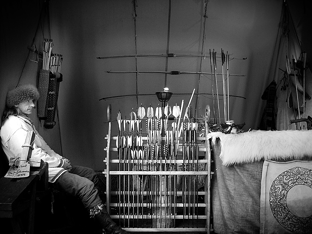
| A straight-to-the-point seven for this flying black and white |
|
| Photographer found comment helpful. |
|
|
12/17/2006 01:20:00 AM |
| Fantastic subject: so unique.If I had to offer any "what I would have done" comment, I think it would be that a tighter crop on the right might have been a better option... I know that you would have had to sacrifice the gorgeous Celtic Knot design on the fabric then, but that would have made the fletcher a wee bit more Primary. Hmm...but I like it as it is too. 9 |
|
| Photographer found comment helpful. |
|
|
12/16/2006 08:44:04 PM |
| I love the lighting and the b&w. Excellent shot. Back to bump you up to 9. |
|
| Photographer found comment helpful. |
|
|
12/15/2006 02:30:44 PM |
| Nice 1st impression :: Don't like that the framing cuts off his feet - especially with nothing gained on top :: Image has a crispness that's quite nice, but the whites are blown to the point of detracting overall :: Great subject choice <<8>> |
|
| Photographer found comment helpful. |
|
|
12/14/2006 12:53:47 PM |
| He feels a little crowded on the left. Really like the b&w conversion - gives us the sense of an earlier time. A white border would really add to that, I think. Nice job burning in the corners to shrink the space. |
|
| Photographer found comment helpful. |
|
|
12/14/2006 11:52:33 AM |
| what an almost surreal image. Nice light. |
|
| Photographer found comment helpful. |
|
|
12/13/2006 05:29:12 PM |
| Severe vignetting is a bit bothersome, but otherwise, I like this one. 6. |
|
| Photographer found comment helpful. |
|
|
12/13/2006 04:36:43 PM |
| I like how the lighting is directed right at the fletchings. It's the first thing my eyes are drawn to. |
|
| Photographer found comment helpful. |
|
|
12/13/2006 03:50:23 PM |
| I love the fact that it's a black and white image. Nice contrast and the lighting was great. |
|
| Photographer found comment helpful. |
|
|
12/13/2006 12:04:07 PM |
|
| Photographer found comment helpful. |
|
|
12/13/2006 11:40:20 AM |
| really like the bw conversion. bored-expression on the guys face is priceless. |
|
| Photographer found comment helpful. |
|
|
12/13/2006 07:17:47 AM |
| Wonderful image! Great feel to it and the b&w treatment is great. I really like that he is not looking at the camera. For some reason if he had been I think some of the strength would have been lost. 8 for now but I might be back. Well done. |
|
| Photographer found comment helpful. |
|
|
12/13/2006 06:18:47 AM |
| interesting subject, B/W good choice. |
|
| Photographer found comment helpful. |
|
|
12/13/2006 12:37:00 AM |
| Now this is great. Possible ribbon. |
|
| Photographer found comment helpful. |
Home -
Challenges -
Community -
League -
Photos -
Cameras -
Lenses -
Learn -
Help -
Terms of Use -
Privacy -
Top ^
DPChallenge, and website content and design, Copyright © 2001-2025 Challenging Technologies, LLC.
All digital photo copyrights belong to the photographers and may not be used without permission.
Current Server Time: 03/12/2025 09:30:10 AM EDT.