| Author | Thread |
Comments Made During the Challenge  |
|
|
12/26/2006 10:33:15 PM |
| need to work with the colour balance |
|
 Photographer found comment helpful. Photographer found comment helpful. |
|
|
12/26/2006 01:24:46 PM |
|
| Photographer found comment helpful. |
|
|
12/25/2006 07:07:36 PM |
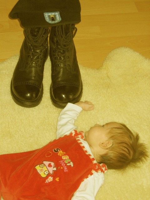
| I like the idea a lot, but the composition feels a little off. I think it might be stronger if the boots were closer and the beret in full view. Hope if this is a family member in Iraq he (or she) comes home soon! |
|
| Photographer found comment helpful. |
|
|
12/24/2006 12:28:43 AM |
| This is a sad sort of photo... I wish that people wouldn't have to miss their family. I think technically the lighting / contrast could be improved as well as the color balance. I do like the composition - it's a bit unusual but I think it works as it seems the child is reaching upwards for a father figure that cannot be obtained. I also really love the message "sweet home" on the clothing as it fits very well with the theme of the photo. |
|
| Photographer found comment helpful. |
|
|
12/23/2006 04:11:04 PM |
| The idea is outstanding. The execution however needs improvement. This photo is sort of washed in a yellow hue. The black boots should be black even if you intended the yellow hue for a mood affect. A little less crop at the top so that there were more of the hat showing might have helped too. Overall contrast and color are what drags this one down for me. Keep smiling though because no matter what the score on this photo and no matter what anyone else thinks Daddy will love it when he gets home or if you email it to him. |
|
| Photographer found comment helpful. |
|
|
12/23/2006 02:13:28 PM |
| Mmm the yellow tinge is distracting, could be a little more in focus, might have had more impact had she been holding/looking at a picture of her father (or whoever those boots belong too). But i know how hard little kids can be to work with so ill give you a 5 |
|
| Photographer found comment helpful. |
|
|
12/23/2006 04:55:57 AM |
|
|
|
12/22/2006 10:31:02 PM |
| needs more dramatic lighting, but good concept |
|
| Photographer found comment helpful. |
|
|
12/22/2006 03:40:23 PM |
very emotive, but technicaly a bit too short (contrast, lighting,..)
keep trying |
|
| Photographer found comment helpful. |
|
|
12/21/2006 09:44:19 PM |
| Poor white balance, boring composition imho. |
|
| Photographer found comment helpful. |
|
|
12/21/2006 12:47:30 PM |
| whole photo has a very 'washed out' feeling to it |
|
| Photographer found comment helpful. |
|
|
12/21/2006 12:19:20 PM |
| There's a yellow color cast to this picture - you can correct this in Photoshop, if you've got it. |
|
| Photographer found comment helpful. |
|
|
12/21/2006 02:57:57 AM |
Aw, man... what a touching moment, title & expressed feelings here. Very emotive & compelling in concept.
Technically, though, it's rubbish (IMHO). The flat lighting & way skewed white balance are a huge irritant to me as well as the "lazy angle" perspective. Makes me think that the scene was thrown together & suddenly it's sincerity goes out the window.
An idea like this deserves better execution!
<< 5 >> |
|
| Photographer found comment helpful. |
|
|
12/20/2006 07:52:55 AM |
| I like the symbolism, but I think the colour balance could be altered to make this a much stronger photo. |
|
| Photographer found comment helpful. |
Home -
Challenges -
Community -
League -
Photos -
Cameras -
Lenses -
Learn -
Help -
Terms of Use -
Privacy -
Top ^
DPChallenge, and website content and design, Copyright © 2001-2025 Challenging Technologies, LLC.
All digital photo copyrights belong to the photographers and may not be used without permission.
Current Server Time: 03/14/2025 03:55:03 AM EDT.