| Author | Thread |
Comments Made During the Challenge  |
|
|
11/04/2003 03:53:56 PM |
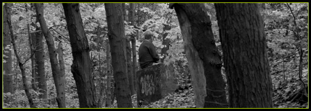
| I see the grace of the trees.. The border is really bad on here. Not sure a color border on a gray scale photo could work well. |
|
|
|
11/03/2003 12:38:25 PM |
| would have liked to see the subject on the left of the frame. |
|
|
|
11/02/2003 10:09:23 PM |
| I like the almost hidden figure, blending in with the trees, at peace with the surroundings. I like the horizontal composition, meks me feel like I am walking through the woods, peering through the trees. Seems like it could be sharper. |
|
|
|
11/02/2003 08:19:29 PM |
| Interesting picture but its difficult to see the subject. I had to look for a while before I realized he was sitting on a block of something. |
|
|
|
10/30/2003 05:20:12 PM |
| I like the idea and the location, but it's hard to see any details. Also, the border is distracting. |
|
|
|
10/30/2003 01:06:56 PM |
| Awfull border, much too distracting. Did this forest have those lovely fall colors ? In that case I would not have turned it B&W. |
|
|
|
10/30/2003 11:00:00 AM |
| The yellow border is very distracting. It is all you see until you force yourself to focus on the image... |
|
|
|
10/30/2003 09:46:02 AM |
| not very relevant. and the contrast camouflaged the supposed subject (I think the man is tha subject right?) its unclear what U are trying to portray. |
|
|
|
10/30/2003 07:15:18 AM |
| Yikes, what is with the luminous green border on a black and white picture? The border should be subtle and unobtrusive, otherwise it is taking away from the picture. The composition is a bit messy, there seems to be too much to look at without a place for the eye to settle. I think your main subject should not be centred in the frame. Not really sure what is especially graceful in this shot. 3 |
|
|
|
10/30/2003 04:29:08 AM |
| Took me a few seconds to see the guy in the picture, I think the border caused that... It distracts a little from the picture, maybe a softer colour? |
|
|
|
10/29/2003 05:49:18 PM |
| The yellow border is quite distracting for this B&W show. I like the idea though. |
|
|
|
10/29/2003 02:41:42 PM |
| very muted colors in this. would have liked to see more contrast. doesn't quite say 'grace' to me though. |
|
|
|
10/29/2003 12:06:15 PM |
| I don't like that the person is right in the middle of the image. The image could have benefited from more contrast imo. The tones are all very close together. |
|
|
|
10/29/2003 11:51:51 AM |
| Whoa with the border! Passing right along here ... |
|
|
|
10/29/2003 09:32:00 AM |
| I think this picture is a little too busy The boy in the picture doesnt stand out and my eyes goes straight to that yellow frame wich I think doesnt fit so well in black and white picture :O I think a little more croping could mabey do something But I think this picture needs more light probably no sun there Anyway its a good idea and I think you could make wonderful Good luck - 5 |
|
Home -
Challenges -
Community -
League -
Photos -
Cameras -
Lenses -
Learn -
Help -
Terms of Use -
Privacy -
Top ^
DPChallenge, and website content and design, Copyright © 2001-2025 Challenging Technologies, LLC.
All digital photo copyrights belong to the photographers and may not be used without permission.
Current Server Time: 03/12/2025 08:11:41 AM EDT.