| Author | Thread |
Comments Made During the Challenge  |
|
|
08/18/2002 03:09:00 PM |
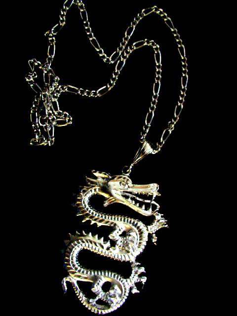
| I have been pondering this photo all week. I decided that I generally like it. I like the placement although the chain should be totally in the photo rather than sneak off the top. That's no big deal though. i like the subject, it's pleasing to look at. The only major thing I noticed is the lighting. It is lit in such a way that in some places it looks gold and in some it looks silver. If it's gold, then the light shining on it makes it look silver, and if it's silver, then something is reflecting on it making it look gold. I don't know what you could do about this though. Maybe someone with some better knowledge of lighting can suggest something. The only thing that comes to mind is to bounce the light, or put something like a thin cloth between the light source and the necklace to kind of make the light a little more mellow. Great idea, and good luck in the challenge. |
|
|
|
08/15/2002 06:47:00 PM |
| Suggestion: make the title possesive as in my newest dragon. I like the shadow play on the dragon itself, but the details seem slightly blurred, esp. the feet. The chain also seems to have a lack of definition, as well. I want to comment/suggest something about the lighting, but I don't know enough to be intelligent, so I will just suggest, try different lighting for this piece (maybe two lights, straight on each side?) 7 Swash |
|
|
|
08/14/2002 02:09:00 PM |
| Nice shot, but it hardly relates to the challenge. The crop on top may be a little too tight -- nothing else was cut off. |
|
|
|
08/13/2002 10:35:00 PM |
Something new.
Composition - pretty good
Technical Aspects - pretty good.
Meets Challenge - yes
Visual Impact / Originality – pretty good
Jim msp
|
|
|
|
08/12/2002 09:45:00 PM |
Composition6
Technical Aspects5
Appeal5
Creativity5
Rating5Autool
|
|
|
|
08/12/2002 03:52:00 AM |
| Focus seems off a little. Composition might be better with the lowest part of the object farther from the bottom--not centered, just a little farther up. |
|
Home -
Challenges -
Community -
League -
Photos -
Cameras -
Lenses -
Learn -
Help -
Terms of Use -
Privacy -
Top ^
DPChallenge, and website content and design, Copyright © 2001-2025 Challenging Technologies, LLC.
All digital photo copyrights belong to the photographers and may not be used without permission.
Current Server Time: 03/12/2025 11:31:50 PM EDT.