| Author | Thread |
|
|
02/08/2007 10:07:44 AM |
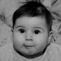
| this was a great series of shots. i thought some of the outtakes were ultimately stronger in the end, and the color ones were worth some merit. |
|
 Photographer found comment helpful. Photographer found comment helpful. |
|
|
01/23/2007 12:38:07 AM |
Greetings from the Critique Club.
Hi Theresa,
An interesting one to draw. You have already recieved a number of fantastic comments; both useful and complimentary. I will do my best to add to what they have already said.
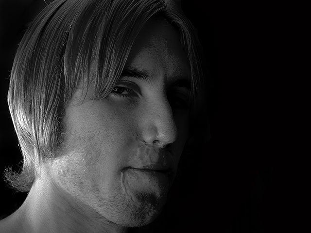
I like what you have done - or more precisely, I like what you have tried to do. The curve of shadow on your son's left side is superb and very dramatic. Unfortunately the right side of the face tells the story of how you achieved it. The highlights on the neck and hair as distracting. This together with the strong shadows on the forehead indicate that you used a small(or un-difused) light source which created the harder look. Please let me know if I am wrong. Anyway, I think a softer light-source (bigger from closer, or difused) would have smoothed this out.
I can't tell if the slight softness of the subject is intentional, or subject movement, or camera movement. I notice that your shutter-speed was 1/8, which is fairly long; so I am guess it was subject movement. On the subject of focus. They say eyes are the window to the soul. This is definitely the case in B&W portraits. There are exceptions, but generally the eyes should be looking at the camera and in sharp focus to really engage the viewer.
I really like your 'Spots' entry, btw.
It is my hope that these insights are helpful and constructive. Please feel free to PM me if you have any questions regarding this critique. And please remember to mark it "Helpful" if you found it so. Good luck with future challenges.
Cheers
Paul
Message edited by author 2007-01-23 00:42:33. |
|
| Photographer found comment helpful. |
Comments Made During the Challenge  |
|
|
01/16/2007 10:14:33 PM |
| good shot.. nice shadows.. |
|
| Photographer found comment helpful. |
|
|
01/16/2007 04:10:39 PM |
| I wish there was just a little more light on the near side of his face, especially the eye. Good luck in the challenge. |
|
| Photographer found comment helpful. |
|
|
01/15/2007 08:20:23 PM |
| awesome message, but the portrait is too dark try to brighten the mid tones |
|
| Photographer found comment helpful. |
|
|
01/12/2007 11:53:19 PM |
| It's obvious something has happened to his face and using this, you have come across creating a very artful (if that is a word lol) portrait. It definitely shows a strong and defiant attitude. It's good - I hope he likes it. |
|
| Photographer found comment helpful. |
|
|
01/12/2007 08:38:15 PM |
| Nice lighting. Focus on eyes? - 7 |
|
| Photographer found comment helpful. |
|
|
01/12/2007 09:38:57 AM |
| i see you attempted to light the subject but here it seems to only really be lighitng the back of his neck....don't be affraid to play around.. My screen is really bright so i dont have problem, but i wouldn't be suprised if people told you that the shot was tooo dark. I get it all the time hehe |
|
| Photographer found comment helpful. |
|
|
01/11/2007 02:03:32 PM |
| Oh, have I seen that attitude! LOL Parents KNOW that look. My only constructive piece of advice on this would be that perhaps, the "highlights" are either too light or too dark and the "shadows" are a bit too dark. But, I see your dilema where if you were to lighten the entire shot, you'd have the really highlighted area in the back of his hair and jawline, almost blanched. Perhaps, a bit of "dodging" would have darkened that area and you could have lightened the brightness just a tad on the entire shot???? |
|
| Photographer found comment helpful. |
|
|
01/11/2007 02:48:31 AM |
| wish I could see more of those interesting looking scars. Blackness on right gratuitious. Good sharpness, focus and grayscale. =6 |
|
| Photographer found comment helpful. |
|
|
01/10/2007 04:55:05 PM |
| The expression captured here really conveys a sense of angst and attitude, and it's nicely processed (love the side light). Only thing that keeps it from being stronger, IMO, is the amount of negative space to the right; cropping 2/3 of that would eliminate a mostly centered comp and strenghthen the facial expression/features. |
|
| Photographer found comment helpful. |
|
|
01/10/2007 03:31:34 PM |
| So there are scars.. but he seems to project "attitude" very well and when people do that, you don't end up seeing scars anymore. |
|
| Photographer found comment helpful. |
|
|
01/10/2007 12:02:32 PM |
| I think this has great potential. I'd love mor contrast. With the light from behind, it leaves his face a bit flat. I do like the composition. |
|
| Photographer found comment helpful. |
Home -
Challenges -
Community -
League -
Photos -
Cameras -
Lenses -
Learn -
Help -
Terms of Use -
Privacy -
Top ^
DPChallenge, and website content and design, Copyright © 2001-2025 Challenging Technologies, LLC.
All digital photo copyrights belong to the photographers and may not be used without permission.
Current Server Time: 03/12/2025 02:30:27 PM EDT.