| Author | Thread |
Comments Made During the Challenge  |
|
|
01/16/2007 01:18:10 AM |
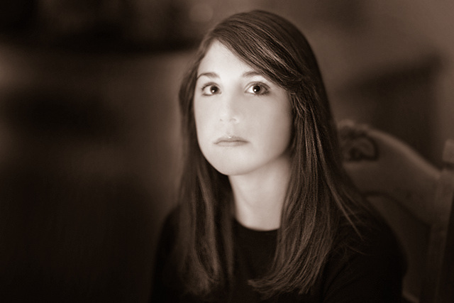
a beautiful photograph, altho not strictly b&W? ...
and i get that too, like how much longer do you need to take my photograph?!! ... |
|
 Photographer found comment helpful. Photographer found comment helpful. |
|
|
01/15/2007 04:24:21 PM |
| Could be a nice shot but too much detail has been lost in her face, especially around her nose, for me to give this a higher score in a portrait challenge. |
|
|
|
01/14/2007 02:43:41 AM |
| first glance tells me this is a face without a nose - darken that feature and you've got a 10 |
|
|
|
01/14/2007 01:31:40 AM |
| great expression, love the dark tones. |
|
| Photographer found comment helpful. |
|
|
01/12/2007 05:46:11 PM |
| Nice composition and focus on the eyes. |
|
| Photographer found comment helpful. |
|
|
01/12/2007 02:54:04 PM |
| ... sepia ... in a B&W challenge? Focus is too soft methinks also. Burning is very obvious. |
|
|
|
01/11/2007 02:54:58 PM |
| Lovely shot but.....The sepia tone just doesn't go well with the "B&W" theme |
|
|
|
01/11/2007 02:31:55 PM |
| This is lovely, she has a nice expression on her face and the editing of the photo is great. |
|
| Photographer found comment helpful. |
|
|
01/11/2007 01:19:34 PM |
| The details of her nose is lost. Harsh light on the face. |
|
|
|
01/11/2007 12:21:05 PM |
| Lost the nose in post-processing. |
|
|
|
01/11/2007 11:03:03 AM |
| her nose seems to be glowing |
|
|
|
01/11/2007 06:01:30 AM |
|
|
|
01/11/2007 12:13:32 AM |
|
|
|
01/10/2007 10:21:20 PM |
| the soft focus on the face - especially around the nose - seems just too soft compared to the detail of the hair |
|
|
|
01/10/2007 06:31:30 PM |
| the lighting unfortunately makes her nose look quite flat. :( |
|
|
|
01/10/2007 04:45:20 PM |
| Flat Lighting. Too much use of blur. |
|
|
|
01/10/2007 04:42:32 PM |
| i find it distracting that her face is out of focus while the hair looks sharp; nice light, though |
|
|
|
01/10/2007 09:46:28 AM |
| I like the softness of this...perhaps a little tool light on the face - you've lost some definition. But I like the "breathing space" around your character...lovely relief from the general Studio Shot. I also like her focus on somewhere just above the camera (I think?). |
|
|
|
01/10/2007 03:22:10 AM |
looks like her nose has already gone.
Maybe a little over exposed or this may have been how you wanted it to look.
however, the person has got her attention ! |
|
|
|
01/10/2007 03:16:23 AM |
| i gave a 7 for this. i don't mind the sepia so much, but her features are a little too washed out for my liking. mostly a good composition though. |
|
|
|
01/10/2007 12:14:26 AM |
| I wish her nose wer in the picture just a little more. from a glance, it looks as if it's not there, kind of eerie |
|
Home -
Challenges -
Community -
League -
Photos -
Cameras -
Lenses -
Learn -
Help -
Terms of Use -
Privacy -
Top ^
DPChallenge, and website content and design, Copyright © 2001-2025 Challenging Technologies, LLC.
All digital photo copyrights belong to the photographers and may not be used without permission.
Current Server Time: 03/12/2025 08:15:33 AM EDT.