| Author | Thread |
|
|
05/05/2007 03:44:30 AM |
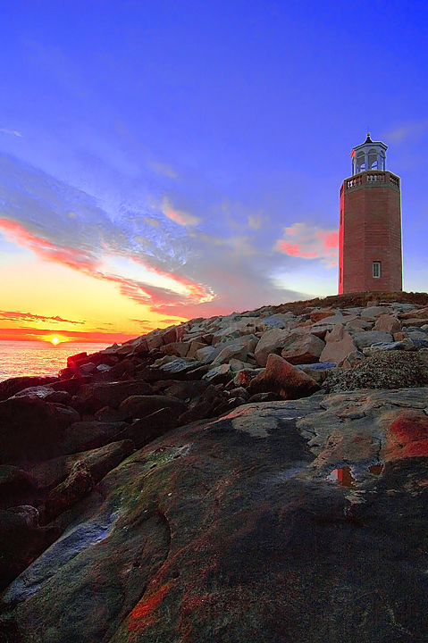
| one thing, the LH is too nearer the frame line. composionally almost centered. slightly good work at photoshop. but why deep red line on the left . why?again there is enough space up or down to reduce and raise the impact of the whole scene. better cut from the foreground. make two L-shaped cardboard cutouts and view the pic.moving them up or down,or sideways and make the best of composition of your good photograph. |
|
 Photographer found comment helpful. Photographer found comment helpful. |
|
|
04/07/2007 03:27:56 PM |
| absolutely beautiful reds! Great perspective, a bit too much saturation, but its still gorgeous! |
|
| Photographer found comment helpful. |
Comments Made During the Challenge  |
|
|
01/24/2007 10:27:32 PM |
| beautiful topic, but i'm not quite sold on the post-processing here. |
|
| Photographer found comment helpful. |
|
|
01/22/2007 07:22:27 AM |
|
| Photographer found comment helpful. |
|
|
01/20/2007 11:09:20 PM |
| This seems a little oversharpened (the white halo around the lighthouse). But you lucked out...I'm a sucker for lighthouses and add one extra point from what I would normal score them. |
|
| Photographer found comment helpful. |
|
|
01/20/2007 01:27:43 PM |
| overly saturated...unneccesary. |
|
| Photographer found comment helpful. |
|
|
01/17/2007 06:11:40 PM |
| Good perspective. Sky's a little overprocessed and foreground is a little dark. Could be a bit sharper overall. |
|
| Photographer found comment helpful. |
|
|
01/16/2007 12:37:46 AM |
| Nice one here re the colors..... |
|
| Photographer found comment helpful. |
|
|
01/15/2007 10:37:34 AM |
|
| Photographer found comment helpful. |
|
|
01/14/2007 10:41:34 PM |
| nice colors, tho there seems to be extra red on the lighthouse - is that just the reflection? |
|
| Photographer found comment helpful. |
|
|
01/14/2007 04:46:50 PM |
| too much saturation. I know dcp members love it, but it does not look real. Saturating a little from the original to give it pop is good, but this is overboard. |
|
| Photographer found comment helpful. |
|
|
01/14/2007 11:24:26 AM |
|
| Photographer found comment helpful. |
|
|
01/13/2007 04:49:20 PM |
| Nice shot. I think showing less of the bottom portion would have done better for this shot. I love the blue hue of the sky! Nicely processed. |
|
| Photographer found comment helpful. |
|
|
01/13/2007 12:53:57 AM |
|
| Photographer found comment helpful. |
|
|
01/12/2007 10:41:44 PM |
|
| Photographer found comment helpful. |
|
|
01/12/2007 10:30:08 PM |
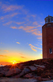
| This can only be one of two people.....hmmmmm.....Avery Point Light...My guess....Peter. |
|
| Photographer found comment helpful. |
|
|
01/12/2007 04:56:26 PM |
| a bit overprocessed imo... |
|
| Photographer found comment helpful. |
|
|
01/12/2007 03:47:38 PM |
| Composition and the elements in this shot are very good. Looks like a bit strong on the saturation for my taste. |
|
| Photographer found comment helpful. |
|
|
01/12/2007 09:47:00 AM |
| NIce sunset glow of light - so real you can smell the salt air. I particularly like the light on the rocks in the foreground. I like the deep blue of the sky - but there seems to be a good bit of noise in the thin clouds at the very top of the frame - probably from boosting the saturation. I wish the red on the lighthouse wasn't so neon bright. The horizon is not quite straight - when I line it up with the edge of the window it is only slightly off, but for some reason it seems more tilted - perhaps the distortion from the lens is adding to the illutsion? |
|
| Photographer found comment helpful. |
Home -
Challenges -
Community -
League -
Photos -
Cameras -
Lenses -
Learn -
Help -
Terms of Use -
Privacy -
Top ^
DPChallenge, and website content and design, Copyright © 2001-2025 Challenging Technologies, LLC.
All digital photo copyrights belong to the photographers and may not be used without permission.
Current Server Time: 03/12/2025 07:43:40 PM EDT.