| Author | Thread |
Comments Made During the Challenge  |
|
|
01/15/2007 03:08:11 PM |
|
|
|
01/13/2007 08:07:01 PM |
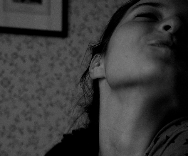
| This would be good if there were more lighting on the subject and maybe even behind the subject. |
|
|
|
01/13/2007 07:06:20 PM |
| exciting, appealling composition. a sense of personality rather than physiognomy. 8 |
|
|
|
01/12/2007 05:30:00 PM |
| The thing which draws my eye is her nostril ... doesn't seem like a flattering portrait. |
|
|
|
01/12/2007 08:10:41 AM |
| I think the picture is both too dark and too gray. Please use more contrast when converting to black and white, don't just desaturate. And I don't like to look up people's noses. |
|
|
|
01/12/2007 02:10:50 AM |
| A little low on contrast for me but great exuberance. 8 |
|
|
|
01/11/2007 09:18:40 PM |
| I think the concept has potential, but the tones are quite flat, and it is a little blurry. |
|
|
|
01/11/2007 04:15:37 PM |
| The lighting doesn't work for me IMHO, and seems a bit out of focus. |
|
|
|
01/11/2007 03:36:44 PM |
| too dark and "snapshot" look to it. |
|
|
|
01/11/2007 12:46:58 PM |
| It's not working for me, to little contrast. And shot perspective on her neck, better is from above. Gives same "tilted pleasure" feeling but we can see the eyes..and thus emotion. |
|
|
|
01/11/2007 11:19:34 AM |
| needs more contrast in the tones |
|
|
|
01/11/2007 10:23:38 AM |
| I understand where you want to go with this, but I think it's not working out in this one. the background distracts too much or at least the frame does. |
|
|
|
01/11/2007 12:33:04 AM |
| The angle is not very flattering for a portrait :-) The printed wallpaper background and partial picture frame is kind of distracting. |
|
|
|
01/10/2007 09:33:33 PM |
| Tones are all a bit on the dark side. It's hard to see the expression. Maybe some levels adjustment. |
|
|
|
01/10/2007 06:11:01 PM |
| would like to see this with more contrast. |
|
|
|
01/10/2007 01:38:31 PM |
| distracting background. skin looks funny. |
|
Home -
Challenges -
Community -
League -
Photos -
Cameras -
Lenses -
Learn -
Help -
Terms of Use -
Privacy -
Top ^
DPChallenge, and website content and design, Copyright © 2001-2025 Challenging Technologies, LLC.
All digital photo copyrights belong to the photographers and may not be used without permission.
Current Server Time: 03/12/2025 12:55:09 PM EDT.