DPChallenge: A Digital Photography Contest You are not logged in. (log in or register
 
Challenge Entries
Portfolio Images
This image is not part of a public portfolio.
The new settlers
The new settlers
gja2600


Photograph Information Photographer's Comments
Challenge: Something New (Classic Editing)
Camera: Olympus C-2100UZ
Location: Florida
Date: Aug 10, 2002
Aperture: 6
ISO: 200
Shutter: 1/30
Date Uploaded: Aug 11, 2002

N/A

Statistics
Place: 153 out of 168
Avg (all users): 3.9048
Avg (commenters): 4.4545
Avg (participants): 3.7840
Avg (non-participants): 4.0236
Views since voting: 898
Votes: 252
Comments: 12
Favorites: 0


Please log in or register to add your comments!

AuthorThread
 Comments Made During the Challenge
08/18/2002 11:10:00 PM
Would have liked them as silhouettes and the focus is a bit off
08/16/2002 11:44:00 PM
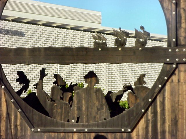
I see what you are trying to get at. However, These were the new settlers in 1492 (I think that's right). Which would technically make them very very old settlers. WE would be the new settlers. But I think that this does make a great point, that EVERYTHING is new at one point or another. So, setting that aside, Could the photo be centered a little better? I do understand that sometimes, for strange reasons (like maybe there's a huge silly resteraunt ad to the left) that it is better if it's not centered. If that's the case, then we'll just have to deal with it. I do see one too many heads in the photo though, and that is an easy fix, just do a little cropping to the bottom, and ta da! This is a very interesting photo. Was this taken on the east coast somewhere? You captured this nicely, good luck with the challenge.
08/15/2002 04:05:00 PM
Contrast a little too high, and maybe a different background to show the full effect of the intricate cut out design.. if it could be taken at a different angle maybe? Not sure if it was possible.
08/15/2002 03:18:00 PM
What was wrong with the old settlers? (pun on your title) The busy, busy background is very distracting, focus is a bit soft around the edges, and you caught yourself in the frame. I like the shadow across the forehead of the man's silhouette, makes it look like he has a hat on. 7 Swash
08/14/2002 11:24:00 AM
On my moniter the top right is somewhat blurry. ??
08/13/2002 02:48:00 PM
It looks like the focus is on the wall behind the object. Mind your focus!
08/13/2002 01:04:00 PM
I like the framing.
08/12/2002 09:08:00 PM
Composition6
Technical Aspects4
Appeal4
Creativity4
Rating5Autool
08/12/2002 07:52:00 PM
This picture would be better if it didn't have such a mixed background. Perhaps if you tilted it so the sky would be the background.
08/12/2002 06:13:00 PM
Subject seems a little out of focus, and tyhe background is a little distracting. Might have been better with the ships against a plain sky, a little closer up?
08/12/2002 09:17:00 AM
strange perspective. what's that in the background? what's in the foreground? do they relate? too many questions...
08/12/2002 05:46:00 AM
can´t understand it. It´s to "local" to understand the mening of this


Home - Challenges - Community - League - Photos - Cameras - Lenses - Learn - Help - Terms of Use - Privacy - Top ^
DPChallenge, and website content and design, Copyright © 2001-2025 Challenging Technologies, LLC.
All digital photo copyrights belong to the photographers and may not be used without permission.
Current Server Time: 03/12/2025 07:22:06 PM EDT.