| Author | Thread |
Comments Made During the Challenge  |
|
|
01/24/2007 11:49:30 PM |
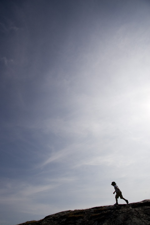
| A good example of "Minimalism" here..... |
|
 Photographer found comment helpful. Photographer found comment helpful. |
|
|
01/24/2007 10:25:53 PM |
| fun shot. i love stuff like this. |
|
| Photographer found comment helpful. |
|
|
01/18/2007 07:12:17 PM |
| A little more of the bottom and less of the sky would have given this photo more depth, in my opinion. Great idea though! |
|
| Photographer found comment helpful. |
|
|
01/14/2007 10:43:08 PM |
| i love the negative space. great job! did you try a version where the foreground was completely blacked out? |
|
| Photographer found comment helpful. |
|
|
01/13/2007 11:33:18 PM |
| Awesome idea but too much free space for me. |
|
| Photographer found comment helpful. |
|
|
01/13/2007 12:19:28 PM |
| Conversion to a high contrast image might have made this work a bit better. Or perhaps accentuate the sky with processing and then select the ground and runner and elevate the contrast and desaturated to a silhouette. Has potential. |
|
| Photographer found comment helpful. |
|
|
01/12/2007 02:14:02 PM |
| for me the sky isn't interesting enough to warrant so much space devoted to it. |
|
| Photographer found comment helpful. |
|
|
01/12/2007 08:29:46 AM |
| cool minimalism, i would try with postprocessing to eliminate the white light, brighten the dark areas and make it black and white, overall good photo i like it |
|
| Photographer found comment helpful. |
|
|
01/12/2007 01:25:55 AM |
| Good use of negatice space the sky could have a lil more WOW though |
|
| Photographer found comment helpful. |
Home -
Challenges -
Community -
League -
Photos -
Cameras -
Lenses -
Learn -
Help -
Terms of Use -
Privacy -
Top ^
DPChallenge, and website content and design, Copyright © 2001-2025 Challenging Technologies, LLC.
All digital photo copyrights belong to the photographers and may not be used without permission.
Current Server Time: 04/26/2025 03:52:06 AM EDT.