| Author | Thread |
Comments Made During the Challenge  |
|
|
01/25/2007 07:33:22 PM |
|
 Photographer found comment helpful. Photographer found comment helpful. |
|
|
01/24/2007 11:54:37 PM |
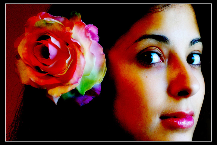
| i see where you're going, but am not a real fan of this type of processing. to me, it's a waste of a very beautiful face. |
|
| Photographer found comment helpful. |
|
|
01/23/2007 04:51:31 PM |
| My eyes do not know whether to look at the flower or the face. I also wish the focus was sharper, especially around her eyes. |
|
| Photographer found comment helpful. |
|
|
01/23/2007 03:05:54 AM |
| Fantastic use of color here. So vibrant and alive. |
|
| Photographer found comment helpful. |
|
|
01/22/2007 01:50:54 AM |
| I don't personally care for the oversaturation. Makes it look sloppy and noisy to me. Nice cropping. |
|
| Photographer found comment helpful. |
|
|
01/21/2007 08:41:00 PM |
| Maybe a little over satureted for my liking... |
|
| Photographer found comment helpful. |
|
|
01/21/2007 02:00:38 PM |
| Love the treatment in this - not photo perfect but it has a very artistic contemporary feel in how the lighting plays up the oversaturated warm colour and the rather grainy bits. Good luck! |
|
| Photographer found comment helpful. |
|
|
01/21/2007 08:46:53 AM |
| I'm not too fond of the processing choices that you made here. I'd bet this would look great if you had pulled back a ton. |
|
| Photographer found comment helpful. |
|
|
01/21/2007 01:29:54 AM |
| Oversaturated and over processed. |
|
| Photographer found comment helpful. |
|
|
01/19/2007 10:31:51 PM |
| Something seems off with the white balance in this shot. Her skin tones do not look natural. |
|
| Photographer found comment helpful. |
|
|
01/18/2007 03:03:43 AM |
| Good composition. A quite daring, and I find, interesting edit. It may not be to a lot of people's taste, but I think it works. I like it, nice job. :-) |
|
| Photographer found comment helpful. |
|
|
01/18/2007 02:57:52 AM |
| Over color saturated ruins it IMO. 6 |
|
| Photographer found comment helpful. |
|
|
01/16/2007 08:08:02 PM |
I've got to rate this high because I just feel in my bones that this is getting hammered by those who don't like heavy processing. One thing that particularly stands out in this image is that it is clear that you nailed the pic's technicals even though it is heavily manipulated. Additionally, in spite of the strong processing, the colors are still very well managed.
10. Easy.
After doing more voting, I came back to this and wanted to add my comment that so far (only 22% of 707 images), this is my favorite in the challenge. |
|
| Photographer found comment helpful. |
|
|
01/16/2007 10:39:45 AM |
|
| Photographer found comment helpful. |
|
|
01/15/2007 08:04:24 PM |
| I'm sure it is intentional but I find the bright red tones on her cheek somewhat distracting. JMHO. |
|
| Photographer found comment helpful. |
|
|
01/15/2007 06:52:03 PM |
| I really like the bold colours and contrast on this. |
|
| Photographer found comment helpful. |
|
|
01/15/2007 06:17:31 PM |
|
| Photographer found comment helpful. |
|
|
01/14/2007 06:14:05 AM |
| a very noisy image that's quite over saturated...the pose and composition is OK, but the edit is horrible |
|
| Photographer found comment helpful. |
|
|
01/13/2007 09:33:34 PM |
| nice expression and composition;a little too overprocessed for my taste, though |
|
| Photographer found comment helpful. |
|
|
01/13/2007 05:37:28 AM |
|
| Photographer found comment helpful. |
|
|
01/12/2007 01:56:24 PM |
| too heavy ont he post processing. the heavy contrast doesn't add to the photo. |
|
| Photographer found comment helpful. |
|
|
01/12/2007 09:50:58 AM |
| way too saturated, contrast too high. good composition and crop |
|
| Photographer found comment helpful. |
|
|
01/12/2007 08:59:32 AM |
| this could be really nice, the processing is off. The tranisition from the light to shadow is really distracting. |
|
| Photographer found comment helpful. |
|
|
01/12/2007 08:08:37 AM |
| IMO, the editing style you chose to PP this with does not do the photo or the model justice. I think it would look better if it was left normal. |
|
| Photographer found comment helpful. |
|
|
01/12/2007 01:19:15 AM |
| This could of been really nice maybe a lil less processing and BW? nice try though |
|
| Photographer found comment helpful. |
Home -
Challenges -
Community -
League -
Photos -
Cameras -
Lenses -
Learn -
Help -
Terms of Use -
Privacy -
Top ^
DPChallenge, and website content and design, Copyright © 2001-2025 Challenging Technologies, LLC.
All digital photo copyrights belong to the photographers and may not be used without permission.
Current Server Time: 03/12/2025 02:57:25 PM EDT.