| Author | Thread |
|
|
01/23/2007 07:30:28 PM |
Hi from the Critique Club.
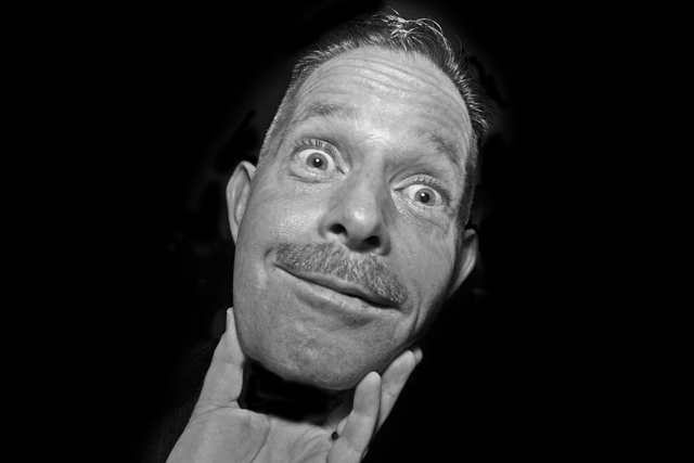
First... This photo definitely caught my eye when browsing the entries. It's certainly a fun, relaxed, 'impromptu' portrait. And it is BW! ;)
From a technical standpoint it could use a slight bump in contrast. Focus seems a little soft as well. The lighting is nice, leaving some shadow areas on the left side of the frame for depth. Good catchlights in the eyes.
I like the 100% black BG and it's possible that a radically off centered crop would have been good. Either leave Steveie in the center and go with a square crop like one of the commentators suggested or crop most of the black space from the left which would leave stevie looking pretty off-balance!
As it relates to the challenge... Pretty hard not to meet the requirements of the challenge, so the technicals became that much more important.
It's wierd in a good way. Keep up the good work.
Mark |
|
 Photographer found comment helpful. Photographer found comment helpful. |
|
|
01/17/2007 04:41:37 AM |
| Yep, it looks kind of weird and kooky, and fun. However, I really think you need to reshoot this to avoid that editing you did. |
|
| Photographer found comment helpful. |
Comments Made During the Challenge  |
|
|
01/16/2007 12:13:52 PM |
| Ok, now this is a liiittttlllee bit strange! :) Funny expression. Looks like his head is being held like a free floating object in the hand. What's that in the background? It's distracting. Good luck in the challenge. |
|
| Photographer found comment helpful. |
|
|
01/16/2007 01:15:41 AM |
| this is soooooo funny ... and pretty clever too ... love that expression ... |
|
| Photographer found comment helpful. |
|
|
01/13/2007 11:53:16 PM |
| Very good. Great shot. Fuuny |
|
| Photographer found comment helpful. |
|
|
01/12/2007 12:28:18 AM |
| ROFL.....interesting take on the challenge...6 |
|
| Photographer found comment helpful. |
|
|
01/11/2007 07:40:49 PM |
| Another creepy shot. Good editing! |
|
| Photographer found comment helpful. |
|
|
01/11/2007 04:01:41 PM |
| amazing composition, but there is something wrong in the lit or post processing.. the skin seems plastic |
|
| Photographer found comment helpful. |
|
|
01/11/2007 03:02:10 PM |
|
| Photographer found comment helpful. |
|
|
01/11/2007 12:01:37 PM |
I wonder if Stevie B knows he looks like Christopher Guest? I'll bet he does :)
a little soft on the focus; it looks like you maybe tried to save some of the blown out highlights by bringing down the top end of the histogram or burning the highlights - the result is kind of flat lighting and loss of detail.
the pose is hilarious. fun entry. :)
P |
|
| Photographer found comment helpful. |
|
|
01/11/2007 01:07:53 AM |
| I think a square crop of this image might reduce the awkward space on the sides. Very entertaining shot though. |
|
| Photographer found comment helpful. |
|
|
01/10/2007 04:46:53 PM |
Ok, there is a raging debte about people's voting habits at the moment, so i will attempt to give a detailed comment with my vote:
Fun photo, altough it's been done before ;)
Now you have noting on the left of the head or on its right, so why keep the wasted space? did you try a square crop? Also I see some funky black spots, or blobs around the head nad hand and that's no good. The facial epression is good and it is to some extent an original photo. 6 |
|
| Photographer found comment helpful. |
|
|
01/10/2007 12:18:55 PM |
| Very cool! Adds a little flavour to a portrait |
|
| Photographer found comment helpful. |
|
|
01/10/2007 11:31:08 AM |
|
| Photographer found comment helpful. |
Home -
Challenges -
Community -
League -
Photos -
Cameras -
Lenses -
Learn -
Help -
Terms of Use -
Privacy -
Top ^
DPChallenge, and website content and design, Copyright © 2001-2025 Challenging Technologies, LLC.
All digital photo copyrights belong to the photographers and may not be used without permission.
Current Server Time: 03/12/2025 04:43:31 PM EDT.