| Author | Thread |
Comments Made During the Challenge  |
|
|
01/25/2007 10:56:23 PM |
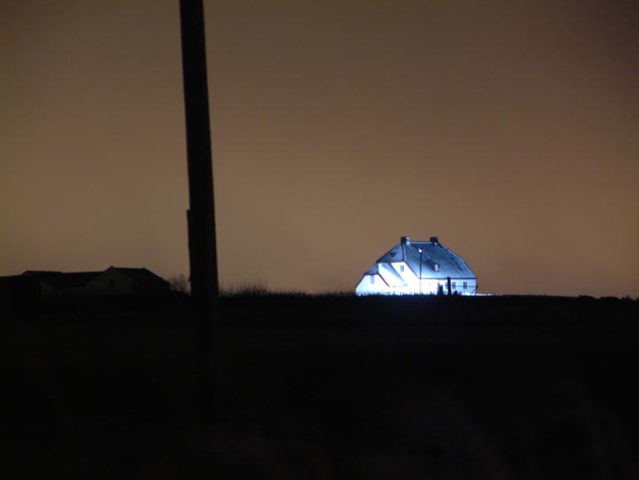
| The lamppost bisects this photo in a way that does nothing to add to the composition IMO. However, I do like the tone of the roof against the sepia sky. |
|
 Photographer found comment helpful. Photographer found comment helpful. |
|
|
01/24/2007 11:57:16 PM |
| The photo seems out of focus to me... |
|
|
|
01/24/2007 10:23:43 PM |
| interesting photo, to say the least. it also leaves me wondering what it is, though, that made you think this represents your best work of the year... |
|
| Photographer found comment helpful. |
|
|
01/24/2007 07:13:55 PM |
| The house is overlit and the foreground is underlit. Try having more ambient light for this kind of shot. |
|
|
|
01/23/2007 07:53:11 PM |
| Very unusual image and suspect you inverted the yellows or the image as a whole? The pole cutting across the image like that is probably more of a deterrant in the visual appeal than anything else. |
|
| Photographer found comment helpful. |
|
|
01/23/2007 04:38:58 PM |
| For me, there is too much dead space, and the house looks overexposed (actually it looks inverted). The pole is distracting. |
|
|
|
01/21/2007 08:44:30 PM |
| Seem to be out of focus and a little soft... |
|
|
|
01/20/2007 02:21:34 PM |
| Interesting use of the available lighting. |
|
| Photographer found comment helpful. |
|
|
01/18/2007 07:16:54 PM |
| Zooming in on the house a little more would have given this photo a higher rating from me. Nice idea though. |
|
| Photographer found comment helpful. |
|
|
01/18/2007 03:32:43 AM |
| Too much empty space all around. Not clear what the point of the photo is about. |
|
|
|
01/16/2007 10:06:38 AM |
| umph. confused here ... the photo is not good. sorry :-) |
|
|
|
01/15/2007 06:14:21 PM |
| IMO the object that is running thru the image just ruins it. Unfortunately it competes for attention from the awesomely lit house. |
|
| Photographer found comment helpful. |
|
|
01/14/2007 10:53:26 PM |
| the big pole kind of takes away from the whole scene. |
|
|
|
01/13/2007 04:16:52 PM |
| I feel this picture lacks a sense of composition. There is too much negative space around the house which I'm assuming is the subject. I think a crop that placed the house in the upper or lower left comer of a square would give this photo more impact. The pole and left side of this picture distract from the house in my opinion. |
|
| Photographer found comment helpful. |
|
|
01/13/2007 12:10:13 PM |
| Colour is not the issue here - I just think there's just too little of interest and you'll probably suffer horribly in the voting. But that said, I do quite like the simple essence of the image in a Stephen King kind of way. This makes me feel as if the house is where someone has taken hostages, or where a crime has been committed - that distant news report/fiction book sort of shot. I hope you see what I mean! To sum up - it's more interesting thann I thought at first glance. |
|
| Photographer found comment helpful. |
|
|
01/12/2007 08:11:49 AM |
|
Home -
Challenges -
Community -
League -
Photos -
Cameras -
Lenses -
Learn -
Help -
Terms of Use -
Privacy -
Top ^
DPChallenge, and website content and design, Copyright © 2001-2025 Challenging Technologies, LLC.
All digital photo copyrights belong to the photographers and may not be used without permission.
Current Server Time: 04/28/2025 06:58:30 AM EDT.