| Author | Thread |
Comments Made During the Challenge  |
|
|
08/23/2002 05:05:00 PM |
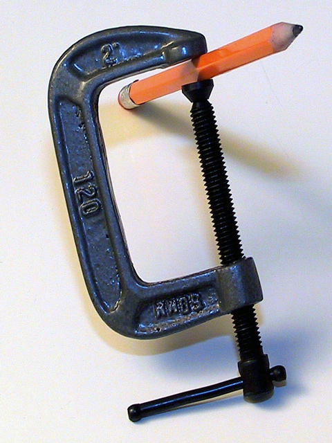
| Interesting idea, I like, but I think a shallower DoF would have made it more catching. |
|
|
|
08/22/2002 04:39:00 PM |
| Great idea, but most of the attention is drawn to the clamp itself though, not to the real point of interest. I think this could have been achieved by shifting everything downwards even though it would have cut off part of the clamp. Somehow, I also would like to see the pencil being really squeezed. |
|
|
|
08/22/2002 02:23:00 AM |
| i like the clean lines and strong angles. very nice. (6) ~mcmurma |
|
|
|
08/21/2002 11:09:00 PM |
| the pencil as good perspective |
|
|
|
08/21/2002 07:56:00 PM |
From my perspective:
Meets challenge:Yes
Technical:Well done
Appeal/Artistic:Ok
Composition:Very good. Strong lines, uncluttered, good background
Originality:Excellent. I don't think the average person would have thought this up. A simple union of two unrelated objects. The yellow pencil stands out among the mostly black and white image.
Comments:Good job. Good luck in the challenge.
|
|
|
|
08/21/2002 06:39:00 PM |
Like the weird angles and the lighting, and the simplicity of contents.
6, Kavey |
|
|
|
08/21/2002 01:28:00 PM |
| Nicely done photo and excellent depth of field :) = 7 - jmsetzler |
|
|
|
08/21/2002 01:00:00 PM |
Very creative idea. IMO (not to offend) I think this would've been better with diff lighting. I'm going to assume that the the grey background was not itentional. I suggest manipulating the white balance on the camera or tweaking the gamma in PS. I say this because when I satarted, I didn't even realize how grey the white was. It also appears to me that the point of focus is on the eraser - where as I would have chosen the point of the pencil. One last thing, I would've prefered to be able to see the details a little more on the screw. I'm in the process of learning about how to manipulate light myself - (boy I need practice), but I think I'm slowly catching on. I do like the composition and the idea...ooh just thought of something - would've been more effective if the pencil appeared to be jumping out/reaching out - I can almost sense that was possible the intention - to me, like I mentioned earlier, would focus on the pencil and use a medium dof - only to slightly blur the back - creating that reaching out effect. I'm in no a way an expert and only giving you my take on this. I still recognize the effort and time put into this. Great job! 5
Ruthann |
|
|
|
08/20/2002 07:11:00 PM |
Composition: Subject Placement, Cropping, Background7,
Technical: Focus, Exposure, Lighting, Processing5,
Challenge: Does your entry meet it?10,
Appeal: Is it Interesting, Motivating, Etc.? 4,
Total Averaged Rating7. Autool
|
|
|
|
08/20/2002 05:53:00 PM |
| It took me a minute to figure this out. It's really neat. Lighting and angle are good. I like how it fits in the frame. Very clever and unique. Another idea is to use a carpenters pencil. I think it would look cool that way too. I like the simplicity of this. It's not too busy and it's a neat balance. You did a nice job of getting in close on this. Don't know if too many people will realize it's only a 2" c clamp. Great job and good luck with the challenge. |
|
|
|
08/20/2002 12:06:00 PM |
| I think if you found some way to eliminate the shadows, possibly by moving the clamp a few feet from the background, this shot would have more of an impact. Also, it looks like the clamp and the pencil are both a little underexposed. |
|
|
|
08/19/2002 12:20:00 PM |
| interesting use of different colored lights |
|
|
|
08/19/2002 05:56:00 AM |
| Technically well done, meets the challenge. |
|
Home -
Challenges -
Community -
League -
Photos -
Cameras -
Lenses -
Learn -
Help -
Terms of Use -
Privacy -
Top ^
DPChallenge, and website content and design, Copyright © 2001-2025 Challenging Technologies, LLC.
All digital photo copyrights belong to the photographers and may not be used without permission.
Current Server Time: 03/12/2025 01:52:32 AM EDT.