| Author | Thread |
Comments Made During the Challenge  |
|
|
02/04/2007 05:11:43 PM |
| i like the concept. i wish the background was smooth |
|
 Photographer found comment helpful. Photographer found comment helpful. |
|
|
02/02/2007 05:05:27 PM |
| I think this works very good in black and white. but the pose is good. |
|
| Photographer found comment helpful. |
|
|
02/02/2007 08:32:56 AM |
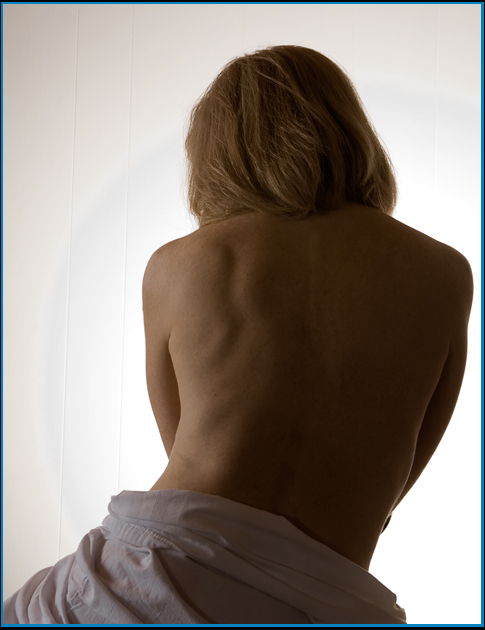
| The lighting doesn't really work for me in this pic. What is the title supposed to mean? |
|
|
|
01/31/2007 01:44:00 PM |
| The lighting is a bit off. The lines in the paneling become a distraction and take away from the feel of the image. |
|
| Photographer found comment helpful. |
|
|
01/31/2007 05:16:26 AM |
| This is far away from High Key. skin tones seem to be way off, tilted lines on the background distract. lacks of contrast. blue frame hurts the image, irregular black frame doesn't make sense at all |
|
|
|
01/30/2007 02:22:22 PM |
The perspective and modest nature of this shot is very nice. The technical quality in sharpening is better than most entries in this challenge.
Hate to disapoint you, but this is not high key photography. The hallmark of high key is the luminosity light curve (or histogram) weighted to the right side of the graph on your main subject. This indicates it contains more light to white pixels than dark. Your main subject has more dark pixels than light. |
|
| Photographer found comment helpful. |
|
|
01/30/2007 01:34:01 PM |
| Clever title. Photo isn't too bad either. Nice use of shape. |
|
| Photographer found comment helpful. |
|
|
01/30/2007 07:19:34 AM |
| E but I think not in high key. in high key there are many whites here I think that there aren't many white tones. |
|
| Photographer found comment helpful. |
|
|
01/29/2007 05:34:12 PM |
| Nice high key. Could probably be even brighter to be high key. composition and crop are great. I think seeing a face profile would help make the image better. |
|
| Photographer found comment helpful. |
|
|
01/29/2007 02:37:05 PM |
| Alarge expanse of skin is uninteresting a better choice of pose and lighting would helpyou must have beter images than this |
|
|
|
01/29/2007 10:28:28 AM |
| very nice a little too much white for my tast but that's just my opinion...good shot |
|
| Photographer found comment helpful. |
|
|
01/29/2007 06:57:38 AM |
| The two-colour background is distracting. |
|
| Photographer found comment helpful. |
|
|
01/29/2007 06:51:29 AM |
| A true white background would have improved this image. |
|
| Photographer found comment helpful. |
|
|
01/29/2007 05:22:46 AM |
| so where's that high key then? this is not high key. |
|
| Photographer found comment helpful. |
|
|
01/29/2007 12:29:25 AM |
| The stripes and the circle of light in the background are a bit distracting, but overall a very nice image! |
|
| Photographer found comment helpful. |
Home -
Challenges -
Community -
League -
Photos -
Cameras -
Lenses -
Learn -
Help -
Terms of Use -
Privacy -
Top ^
DPChallenge, and website content and design, Copyright © 2001-2025 Challenging Technologies, LLC.
All digital photo copyrights belong to the photographers and may not be used without permission.
Current Server Time: 03/12/2025 07:05:01 PM EDT.