| Author | Thread |
|
|
02/16/2007 11:53:05 PM |
this is nice work - your comment made me LOL! A kid just came in to see what I was laughing at - he didn't get it. :-)
|
|
 Photographer found comment helpful. Photographer found comment helpful. |
|
|
02/07/2007 10:32:58 AM |
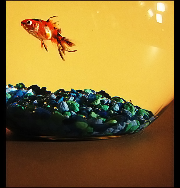
Sorry to hear about the fish not making it. :(
Overall, pretty decent results for the challenge! :) |
|
| Photographer found comment helpful. |
Comments Made During the Challenge  |
|
|
02/06/2007 10:44:05 PM |
|
| Photographer found comment helpful. |
|
|
02/06/2007 06:57:06 PM |
| Nice idea, but lighting is kind of harsh and the reflected lights in the bowl are distracting. Seems to be oversharpened and a bit unnatural looking. 6 |
|
| Photographer found comment helpful. |
|
|
02/06/2007 11:40:21 AM |
| nice, love the bright yellow and the orange of the fish! |
|
| Photographer found comment helpful. |
|
|
02/04/2007 10:25:26 PM |
|
| Photographer found comment helpful. |
|
|
02/04/2007 06:00:01 PM |
| I love the cropping and the compostion. Great photo. |
|
| Photographer found comment helpful. |
|
|
02/01/2007 07:55:51 PM |
| Neat and creative shot. Don't care for the hot spot/reflections on the glass in the upper right though. |
|
| Photographer found comment helpful. |
|
|
02/01/2007 11:50:38 AM |
| I love your idea. I don't care for the border, but it's not affecting my score since overall it's pretty interesting. Solid 8 for me. |
|
| Photographer found comment helpful. |
|
|
02/01/2007 01:01:48 AM |
|
| Photographer found comment helpful. |
|
|
01/31/2007 03:55:34 PM |
|
| Photographer found comment helpful. |
|
|
01/31/2007 03:30:36 PM |
|
| Photographer found comment helpful. |
|
|
01/31/2007 12:23:29 PM |
I love the simplicity of this image.
I like how the fish bowl takes up most of the space. |
|
| Photographer found comment helpful. |
|
|
01/31/2007 10:13:12 AM |
Right idea. I think this has potential. However there are a few things that are going to pull this shot down overall. 1) The harsh glare from the lights in the upper-right of the fish bowl. 2) Composition - the fish could use a little more room at the top - or - a little less table, to balance this better. 3) Tabletop is a little dirty (hard to see until you load the image on your PC sometimes I know). 4) Odd shaped borders.
All of the above is JMO of course and not meant to be personal. :D Good luck to you in the challenge. |
|
| Photographer found comment helpful. |
|
|
01/31/2007 09:43:13 AM |
| I like how the fish and the rocks are clear. the image is very simple yet it gets my attention. |
|
| Photographer found comment helpful. |
Home -
Challenges -
Community -
League -
Photos -
Cameras -
Lenses -
Learn -
Help -
Terms of Use -
Privacy -
Top ^
DPChallenge, and website content and design, Copyright © 2001-2025 Challenging Technologies, LLC.
All digital photo copyrights belong to the photographers and may not be used without permission.
Current Server Time: 03/11/2025 01:54:44 PM EDT.