| Author | Thread |
|
|
11/20/2003 01:58:05 AM |
Greetings from The Critique Club
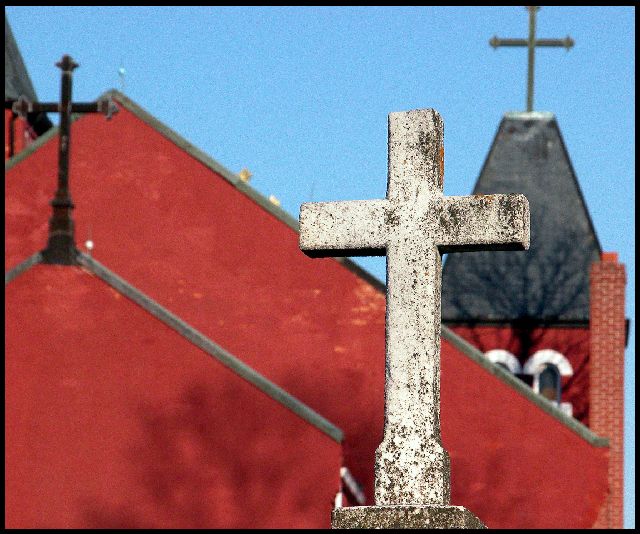
Very good idea. It looks almost abstract. Meets the challenge's subject, there is no doubt about. Somehow... I wish the picture had some warmer tones. Even the red is a bit on the cold side. Nice use of DOF. If only the image wasn't that noisy... Maybe you intended a grained effect but it isn't working for me. The main subject looks well focused. I like the tree shadow on the background but I am not too crazy about the one in the foreground as it is so diffuse. But what do you do? Cut the tree out? Maybe a different time of the day would have helped... Now we will never know. But if you try a retake, make sure you have all three crosses in view. But try to lose the higher tower that is only partially in view. Try a different angle for that. Adjust the ISO to 100 if you take the picture during day time. This will lessen the noise.
Anyway, good work. It was a pleasure to comment on it even it is not your best and you know it. Keep up the good work. One of these days you will get a blue ribbon, I can see it approaching.
Best regards,
Elena |
|
Comments Made During the Challenge  |
|
|
11/16/2003 11:35:00 PM |
| This is a wonderful idea with the different crosses, I like the DOF on this shot, bringing your attention to the front cross. The cutting off of the top of the back cross hurts a bit and the strip of blue on the right is distracting to me. The border does work well. I started at a 6 on this, am going to a 7 |
|
|
|
11/16/2003 09:48:18 PM |
| Good composition and use of DOF. The grain or noise complements this shot; to me that's unusual. One technical issue: the right most cross should not have been cut off in this composition. |
|
 Photographer found comment helpful. Photographer found comment helpful. |
|
|
11/16/2003 11:01:39 AM |
|
| Photographer found comment helpful. |
|
|
11/15/2003 01:19:34 PM |
| I like this but where did you find so many crosses in one place? I mean, what church is advertising itself so much? Or is it that several competeing churches? |
|
| Photographer found comment helpful. |
|
|
11/14/2003 10:12:16 PM |
| You may have cropped just a little too much here, or perhaps you were just too close. This shot is marvelous, and would only improve had all three crosses been complete and had breathing room. I love the focus and tones and contrasting textures and colors. Well seen! 8 |
|
| Photographer found comment helpful. |
|
|
11/14/2003 05:50:35 AM |
| Love the colors on this, but the DoF doesn't blow my skirt up. |
|
| Photographer found comment helpful. |
|
|
11/13/2003 12:44:50 PM |
| Nice depth. it would be interesting to see the focus on the middle cross. It does lead one from the front to back fairly good, stopping in the middle. |
|
| Photographer found comment helpful. |
|
|
11/12/2003 04:00:25 PM |
| lots of potential - and feels like its almost there - the composition just seems a touch out of wack - with the top cross being cropped, and the left one merging with the roof behind it. A scene with a lot of potental. The tree shadow doesn't seem appropriate either |
|
|
|
11/11/2003 02:56:34 PM |
One of the top shots in the challenge! A little NeatImage woul do the shot wonders!
The shot is well balanced and the perspective is very good. I would've loved to see the top of the last cross.. still a 9 from me! |
|
| Photographer found comment helpful. |
|
|
11/10/2003 10:15:47 PM |
| awesome composition. super interesting, nice red on blue- even the grainy quality of the out of focus spots work.-but if the blue was crisp and true you would have a winner in my book. |
|
| Photographer found comment helpful. |
|
|
11/10/2003 09:38:01 PM |
| Quite an interesting composition, it really captured my attention. I like the colors, and the great lines and angles. The 3 crosses are great. There are a couple of distractions, but not much you can do about that, is there?! |
|
| Photographer found comment helpful. |
|
|
11/10/2003 08:02:02 PM |
| While this was a good idea and I love things with red in them, this picture was not clear at all. IMHO I would have preferred that the crosses were really sharp. The sky also loooks very noisy. |
|
| Photographer found comment helpful. |
|
|
11/10/2003 06:32:51 PM |
| Nice layers in this image, nice use of DOF. |
|
|
|
11/10/2003 04:55:41 PM |
|
| Photographer found comment helpful. |
|
|
11/10/2003 02:37:45 AM |
| I love the use of DOF here. |
|
| Photographer found comment helpful. |
Home -
Challenges -
Community -
League -
Photos -
Cameras -
Lenses -
Learn -
Help -
Terms of Use -
Privacy -
Top ^
DPChallenge, and website content and design, Copyright © 2001-2025 Challenging Technologies, LLC.
All digital photo copyrights belong to the photographers and may not be used without permission.
Current Server Time: 03/13/2025 12:51:49 AM EDT.