| Author | Thread |
Comments Made During the Challenge  |
|
|
08/23/2002 05:30:00 PM |
|
|
|
08/23/2002 12:53:00 AM |
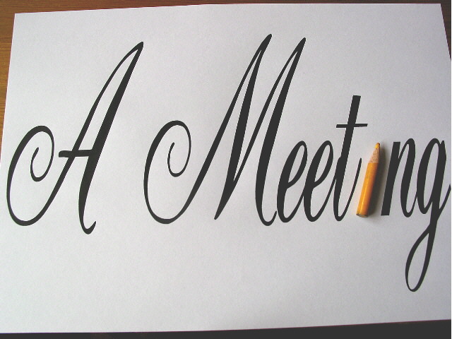
| Now, this is a cute idea! I like the composition, lettering, and cropping. |
|
|
|
08/22/2002 04:34:00 PM |
| yep, most original idea up to now! hope you don't mind 'original' - some people dislike this comment. 7 |
|
|
|
08/22/2002 04:07:00 PM |
| Good idea I just wish you could have filled the frame with the paper cropping the dark corners. |
|
|
|
08/22/2002 09:20:00 AM |
Composition: Subject Placement, Cropping, Background5,
Technical: Focus, Exposure, Lighting, Processing6,
Challenge: Does your entry meet it?10,
Appeal: Is it Interesting, Motivating, Etc.? 4,
Total Averaged Rating6. Autool
|
|
|
|
08/21/2002 10:23:00 PM |
Composition - quite good
Technical Aspects - very good
Meets Challenge - yes
Visual Impact / Originality � quite good/ high
Other suggestions � I don't like the wood/table showing. Minor problem.
Jim msp
|
|
|
|
08/21/2002 07:24:00 PM |
| This is a great idea! very creative. You probably got lots of framing comments, so I will pass there. Did you want to vary the lighting from light to dark, left to right? If so, skip the next sentence. Suggestion: two lights from either side, nice balance. Nice play on words on your title. 8 Swash |
|
|
|
08/21/2002 06:08:00 AM |
| Great idea, and I'd like it even more if the backround was completely white, no brown edges. |
|
|
|
08/20/2002 08:44:00 AM |
| clever idea. I would prefer a little more lighting coming from the right hand side so that it was even all the way across. 8 |
|
|
|
08/20/2002 07:00:00 AM |
Interesting idea - perhaps more of the table below or none at all (I think my pref would be none at all). Lighting a little uneven, seems darker at right.
Kavey |
|
|
|
08/19/2002 09:09:00 PM |
| good pun, okay picture. It just isn't too visually exciting but it raised a smile ;) |
|
|
|
08/19/2002 06:01:00 PM |
|
|
|
08/19/2002 02:33:00 PM |
| Bravo, great message, great shot, wonderful creative idea. Score 8 ~Kee |
|
|
|
08/19/2002 02:08:00 PM |
| Clever and contrasty. complimentary lighting and background edges. |
|
|
|
08/19/2002 01:29:00 PM |
| Cute idea! The cropping is a little off, though. The dark table behind the white paper is a little distracting. You might want to play around with that a bit. Good luck in the contest! KrazyKat |
|
|
|
08/19/2002 10:24:00 AM |
| I really wanted to give this a 10. There is humor, creativity, lighting is perfect. However, I wish the frame was better. I don't like seeing the edges of the paper. I could see this as a poster hanging in a office. I know shots from above are really hard to get, especially if you don't have a tripod. Just keep trying at it and take LOTS of pictures of the exact same thing. Great shot and good luck in the challenge. 9 |
|
|
|
08/19/2002 09:36:00 AM |
| Generally this is a pretty good idea! The only think I have to complain about is the pencil seems small compared to the size of the entire image. However it is depicted as the main subject of the image so I may just be complaining for nothing! |
|
|
|
08/19/2002 12:46:00 AM |
|
Home -
Challenges -
Community -
League -
Photos -
Cameras -
Lenses -
Learn -
Help -
Terms of Use -
Privacy -
Top ^
DPChallenge, and website content and design, Copyright © 2001-2025 Challenging Technologies, LLC.
All digital photo copyrights belong to the photographers and may not be used without permission.
Current Server Time: 03/13/2025 03:17:24 AM EDT.