| Author | Thread |
|
|
03/10/2007 08:55:07 AM |
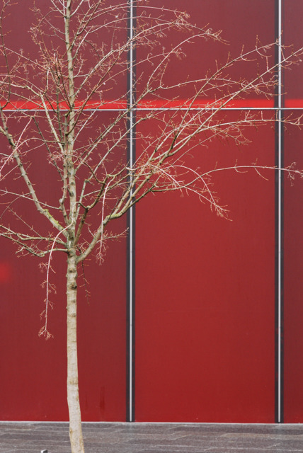
I agree with everybody else, to bad about the size of the wall. With more wall and tree I think it would have scored better, I really like the contrasts.
|
|
 Photographer found comment helpful. Photographer found comment helpful. |
|
|
03/07/2007 07:43:05 AM |
| Really nice shot. I think I would like it better with the sidewalk cropped off the bottom. Looking forward to seeing your shot for "Red II". It looks like you have plenty of good subjects. |
|
| Photographer found comment helpful. |
|
|
03/05/2007 06:36:53 PM |
| I really like the tree against the red wall. Looks great. |
|
| Photographer found comment helpful. |
|
|
03/05/2007 01:08:51 PM |
| Good for your wife. This is a terrific picture with a harmonious linear composition (or something like that). The fact that it nevertheless garnered a score under 6.5 is manifest evidence that you are among Philistines. Present company excepted. Had you been able to eretain the compositional theme (i.e. keep the unbroken wall background) while including the top of the tree and the rest of it to the right, then it might have improved the result. Maybe. Way underrated shot, anyway. |
|
| Photographer found comment helpful. |
|
|
03/02/2007 10:32:44 AM |
| Nice composition. I think you're going in the right direction with the processing. |
|
| Photographer found comment helpful. |
|
|
03/02/2007 07:04:36 AM |
Jason, I have two thoughts on this. 1. This is a really neat abstract looking shot with the lines in it. A little saturation boost might have made this even more interesting. 2. This would also be really cool if the lines weren't there and it was just a solid red background. The composition is absolutely perfect.
Edit: Forget what I said about the saturation boost. I didn't realize till after that this was a minimal entry.
Message edited by author 2007-03-02 08:00:06. |
|
| Photographer found comment helpful. |
Comments Made During the Challenge  |
|
|
02/27/2007 11:09:39 PM |
| great color and composition |
|
| Photographer found comment helpful. |
|
|
02/23/2007 07:18:51 PM |
| needs a bit more DOF to make it really pop. Great idea otherwise |
|
| Photographer found comment helpful. |
|
|
02/23/2007 08:53:02 AM |
|
Home -
Challenges -
Community -
League -
Photos -
Cameras -
Lenses -
Learn -
Help -
Terms of Use -
Privacy -
Top ^
DPChallenge, and website content and design, Copyright © 2001-2025 Challenging Technologies, LLC.
All digital photo copyrights belong to the photographers and may not be used without permission.
Current Server Time: 03/13/2025 06:53:08 AM EDT.