| Author | Thread |
|
|
08/27/2002 07:49:00 AM |
| Can anyone tell me who gave me the 10? I need to knwo where I can send the money :) |
|
Comments Made During the Challenge  |
|
|
08/25/2002 10:27:00 PM |
| Great idea, terrific title. I would suggest some other lighting idea, so that the light is not straight on, which to me makes the photo seem flat. If you lit it from the side or bottom, it might be more dramatic. I think you sharpened them just right- very balanced. |
|
 Photographer found comment helpful. Photographer found comment helpful. |
|
|
08/25/2002 06:39:00 PM |
|
|
|
08/25/2002 12:53:00 PM |
|
|
|
08/24/2002 10:22:00 PM |
| Good concept. The lighting or something is wron here. Can't quite place it, just seems a bit blurry. |
|
|
|
08/24/2002 04:15:00 PM |
| Image is quite flat (lacks contrast). Nice concept. |
|
|
|
08/23/2002 02:40:00 PM |
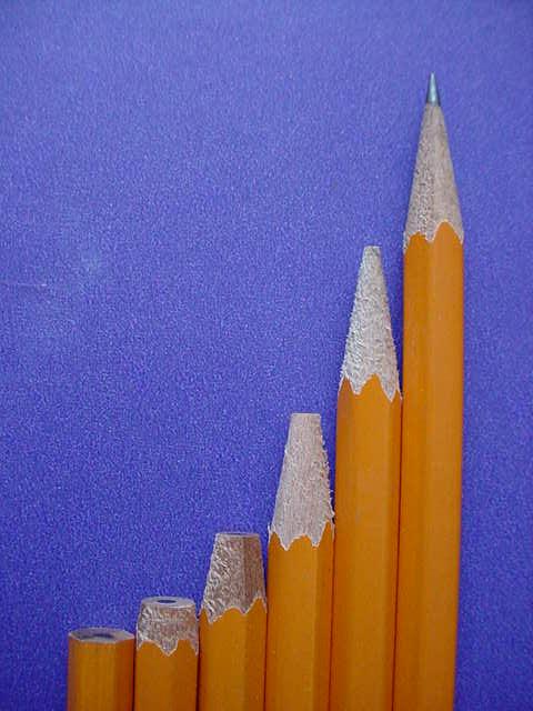
| You did a great job of lining up the edge of the pencils with the edge of the photo. This idea is great and I love the background. Now, I know this is getting picky, and it doesn't affect my score in any way, but ther seems to be a blemish in the background on the left hand side just over half way up. Like I said, doen't affect my rating, just an observation. The lighting is beautiful. I love how the yellow pencils seem to stand out on the blue background. Great job and good luck in the challenge. |
|
|
|
08/21/2002 03:51:00 PM |
Nice idea. I like the sweep of the curve. I think I would have focused on the tip of the final pencil and let the other ones blur a little instead of the reverse.
|
|
|
|
08/21/2002 10:28:00 AM |
| This might work better with a smoother background. The texture there sort of washes out the depth and detail of the pencil points. |
|
|
|
08/20/2002 05:43:00 PM |
Like the textures and colours very much, though think the yellow would sing out more with a little more light on it. Would prefer if pencils were more accurately vertical.
Kavey |
|
|
|
08/20/2002 09:18:00 AM |
Composition: Subject Placement, Cropping, Background8,
Technical: Focus, Exposure, Lighting, Processing6,
Challenge: Does your entry meet it?10,
Appeal: Is it Interesting, Motivating, Etc.? 5,
Total Averaged Rating7. Autool
|
|
|
|
08/19/2002 06:22:00 PM |
| I liked the idea, but personally, the image quality and the background does not help. |
|
|
|
08/19/2002 06:16:00 PM |
| How in the world did u ever get this whole family together for a portrait on such short notice? Good choice of color for the background |
|
|
|
08/19/2002 05:35:00 PM |
|
|
|
08/19/2002 01:43:00 PM |
| Nice idea, but I think you could have done some things better. A little more light on the pencils would help them stand out more. Also, you might want to set them up a few feet in front of the background to give some depth. The tip of the pencils at the far right and far left are out of focus. This could use a little counter-clockwise rotation and you should save at the best quality that gives you a file less than 150k. There are some jpeg artifacts. |
|
| Photographer found comment helpful. |
|
|
08/19/2002 12:08:00 PM |
| It's great except for the background and the lack of focus on the sharpest pencil. |
|
|
|
08/19/2002 11:50:00 AM |
| Clever idea. Slightly sharper image would have help this a lot� |
|
|
|
08/19/2002 10:35:00 AM |
| this is very original! maybe the background could have been a different color because its kind of an eyesore for me, maybe a little saturation in the colors would brighten it. |
|
|
|
08/19/2002 09:49:00 AM |
| Good composition - leads my eye up the "steps" to the point of the sharpened pencil... which is then slightly out of focus. I'd like to see that in focus as the subject seems to be the tips of the pencils. I like the dof, don't get me wrong. Everything in sharp focus would just be flat....just needs to have the attention shifted. |
|
| Photographer found comment helpful. |
|
|
08/19/2002 04:00:00 AM |
| The top of the longest pencil seems slightly out of focus. The blue background would have been better if it were smoother without a grain. Nice idea. |
|
Home -
Challenges -
Community -
League -
Photos -
Cameras -
Lenses -
Learn -
Help -
Terms of Use -
Privacy -
Top ^
DPChallenge, and website content and design, Copyright © 2001-2025 Challenging Technologies, LLC.
All digital photo copyrights belong to the photographers and may not be used without permission.
Current Server Time: 03/12/2025 02:35:26 AM EDT.