| Author | Thread |
|
|
03/04/2007 02:08:27 PM |
Greetings from the Critique Club
First of all, welcome to the madhouse that is DPC!!
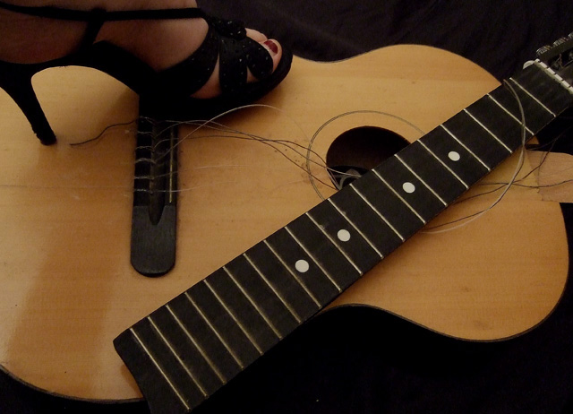
In reading through the comments given below, I think the major issue with this picture has already been identified - lighting. The idea is very good, the composition is pretty good, too, with the neck of the guitar forming a nice diagonal. To get your point across, I think the shoe and foot need to be a bit more prominent in the picture. And overall, you need more, less flat light. For those of us who don't have studios, you can try shooting outdoors, preferably on a cloudy day, which provides nice even light, or use some indoor lights available in your house. I've used desk lamps and large pieces of white posterboard as "reflectors", opposite the desk lamps to provide reflected light and help reduce shadows.
In this picture, some stronger light coming from the lower right would add some texture and depth, I think. You'd still need some from the above left to highlight the shoe and face of the guitar.
If you have any questions about my critique, please don't hesitate to send me a PM. You've got a good eye and a creative approach - best of luck and keep shooting! |
|
 Photographer found comment helpful. Photographer found comment helpful. |
Comments Made During the Challenge  |
|
|
02/27/2007 12:47:41 AM |
| not enough contrast, flat lighting |
|
| Photographer found comment helpful. |
|
|
02/25/2007 08:02:46 PM |
| gaaaaaaahh that hurts too much.... |
|
| Photographer found comment helpful. |
|
|
02/22/2007 02:51:39 PM |
| Really nice idea, shows the emotion well. Would like to see a little richer lighting - took me a minute to see the foot. |
|
| Photographer found comment helpful. |
|
|
02/22/2007 06:27:23 AM |
| I'd almost like to see the guitar more broken and a little more of the foot in the shoe. great idea though |
|
| Photographer found comment helpful. |
|
|
02/21/2007 09:21:15 PM |
|
| Photographer found comment helpful. |
|
|
02/21/2007 01:27:52 PM |
| Good idea. I like where you went with this challenge. The setup was great. It suffers from bad lighting/exposure and cutting the foot off. Those fixed, it would score a point higher. |
|
| Photographer found comment helpful. |
|
|
02/21/2007 12:43:42 PM |
| OUCH! A true picture of hate indeed! Wonderful idea, just a tad too dark. |
|
| Photographer found comment helpful. |
|
|
02/21/2007 12:20:28 PM |
| Creative idea, i like the composition! |
|
| Photographer found comment helpful. |
Home -
Challenges -
Community -
League -
Photos -
Cameras -
Lenses -
Learn -
Help -
Terms of Use -
Privacy -
Top ^
DPChallenge, and website content and design, Copyright © 2001-2025 Challenging Technologies, LLC.
All digital photo copyrights belong to the photographers and may not be used without permission.
Current Server Time: 03/11/2025 02:39:10 PM EDT.