| Author | Thread |
|
|
11/27/2003 06:32:40 AM |
Critique Club:
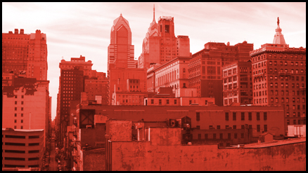
This is a very interesting study in geometric shapes, you've chosen a good viewpoint for this photo. This picture met the challenge imaginatively and creatively.
There are a few ways I personally would try to improve the photo:
The photo is too small here. Try to submit photos where the longest side is 640 pixels.
I would like to see more contrast between the various reds so that the geometric lines of the buildings are defined better. This can be achieved with the curves tool in Photoshop.
I think you need more negative space at the top of the frame.
Other things I really liked:
The texture of the sky works really well.
I like the subtle diagonal in the composition going from the top-left to the bottom-right.
To summarise: a great picture, but perhaps lacking in compositional contrast. I think including more sky would have made this a more dramatic and interesting picture by contrasting the busy architectural lines with the smooth and wispy sky. |
|
Comments Made During the Challenge  |
|
|
11/19/2003 03:15:40 PM |
| really nice photo...I wish it were a little larger, it would be more dramatic. Nice color hue. Very smooth and clear...good job. |
|
 Photographer found comment helpful. Photographer found comment helpful. |
|
|
11/17/2003 05:04:51 PM |
| I think I would have prefered a red mainstreet (or the entertainment district) featured shot as apposed the skyline. Just my opinion though. |
|
|
|
11/17/2003 03:34:01 PM |
| A clever idea! Wish you had submitted a larger version, though... |
|
| Photographer found comment helpful. |
|
|
11/17/2003 11:17:01 AM |
| Hrm, an unusual duotone for a cityscape, but obviously purposefully done to reflect the title. It seems a little small, not sure if that's the full 640 pixels allowed or not, and I think that lends itself to making me feel very confined or cluttered. There is also not much contrast between the buildings and so I think that could be another reason why they just feel clumped together. Finally, I realise there was a point to the color, but it just feels unnatural and so my instinct is to not instantly like it. Maybe a red tint with more contrast would have been better received, not sure. It's not horrible, it's just not really grabbing me. |
|
| Photographer found comment helpful. |
Home -
Challenges -
Community -
League -
Photos -
Cameras -
Lenses -
Learn -
Help -
Terms of Use -
Privacy -
Top ^
DPChallenge, and website content and design, Copyright © 2001-2025 Challenging Technologies, LLC.
All digital photo copyrights belong to the photographers and may not be used without permission.
Current Server Time: 03/12/2025 06:46:35 PM EDT.