| Author | Thread |
Comments Made During the Challenge  |
|
|
03/13/2007 08:06:25 PM |
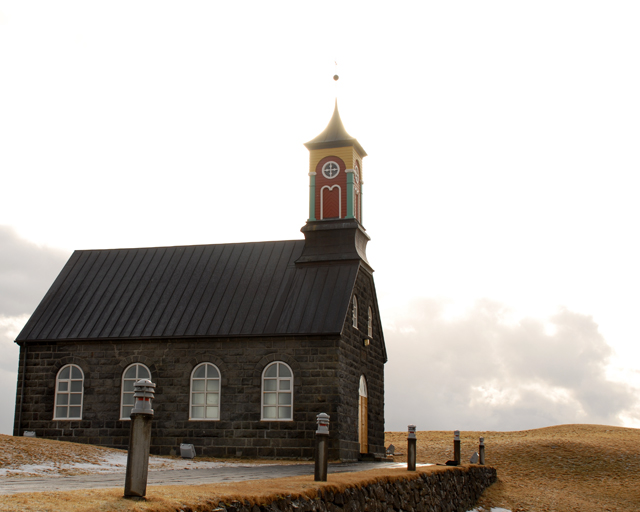
| Church looks great... i really like the picture. I wish the sky wasn't so burned out... but maybe that was the effect you were going for. |
|
|
|
03/13/2007 03:46:00 PM |
| I like the composition and perspective, and i think I understand the bright light at the top. On one hand it gives the shot a bit more interest, and on the other, it kinda detracts. I'm guessing it will be one of those things that people either love or hate. |
|
|
|
03/12/2007 11:35:06 AM |
| I love this shot. The clouds in the background are very nice. |
|
|
|
03/12/2007 10:24:33 AM |
| The neutral colors are very nice, I don't think the angle is the best, but good job! |
|
|
|
03/11/2007 09:59:51 PM |
| I think the ball being blown out so it appears floating is a distraction. From the bottom edge of the roof down I think the image looks good. Maybe a stronger angle towards the left. |
|
|
|
03/11/2007 05:31:07 PM |
| Awesome lighting! The blinding light from the sky is used as backlighting to a great effect, but you also have perfect exposure on the foreground, particularly the facing wall of the church where the detail is very good. |
|
|
|
03/11/2007 02:28:36 PM |
| Nice photo, a pity the sky is so blown out but I guess if you'd had a darker sky you'd lose much of the colour of the church itself. |
|
|
|
03/09/2007 01:31:25 PM |
| for my taste the sky is too burned out and overexposed. |
|
|
|
03/08/2007 07:59:33 PM |
| The sky is just a bit too bright for my taste. |
|
|
|
03/08/2007 07:46:06 PM |
|
|
|
03/08/2007 12:50:37 PM |
| The sky being so blown out really takes away from this image. |
|
|
|
03/08/2007 08:09:06 AM |
| Wonderful shot! Perfect placement, d-o-f, setting and subject. High class! |
|
|
|
03/08/2007 01:59:59 AM |
| I am surprised we didn't see more church shots - Nice simple image. Like the soft light at the spire - Nice. |
|
|
|
03/07/2007 11:56:11 PM |
| Nice pleasing to the eye image here..... |
|
|
|
03/07/2007 06:44:16 PM |
| Great shot! Would have been even better if you had been allowed more editing than basic, like dodge & burn for the clouds. But it's still one of the best in this challenge. |
|
|
|
03/07/2007 05:21:31 PM |
| The sentiment makes me want to hurl, but the photo is great. |
|
|
|
03/07/2007 02:42:29 PM |
| Lovely topic, love the composition and such a dramatic location too. Nice processing. 8 |
|
|
|
03/07/2007 12:58:43 PM |
|
|
|
03/07/2007 12:11:15 PM |
|
|
|
03/07/2007 11:12:48 AM |
| good angle, but the sky seems over exposed, but I'm torn on that, because I like the light around the steeple. |
|
|
|
03/07/2007 10:00:01 AM |
|
|
|
03/07/2007 09:57:44 AM |
| I would have loved to see more focus on the steeple. Great idea. |
|
|
|
03/07/2007 07:26:38 AM |
| possobly but If you saw this pic in a postcard stand in the street would you even think about Alternative Medicine? |
|
|
|
03/07/2007 12:10:44 AM |
| too bad the sky is blown out at the top. so close. i love the color range. |
|
Home -
Challenges -
Community -
League -
Photos -
Cameras -
Lenses -
Learn -
Help -
Terms of Use -
Privacy -
Top ^
DPChallenge, and website content and design, Copyright © 2001-2025 Challenging Technologies, LLC.
All digital photo copyrights belong to the photographers and may not be used without permission.
Current Server Time: 03/14/2025 01:36:21 AM EDT.