| Author | Thread |
Comments Made During the Challenge  |
|
|
12/02/2003 06:35:20 PM |
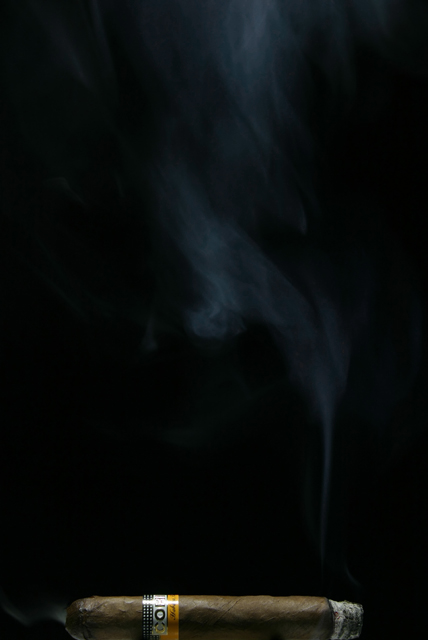
| Great use of negative space. I love this one (expect for the highlight on the label but that is just a very small distracting element). (9) |
|
 Photographer found comment helpful. Photographer found comment helpful. |
|
|
12/01/2003 12:55:17 AM |
| Wonderful. I can just about smell it. Nice! |
|
| Photographer found comment helpful. |
|
|
11/30/2003 01:46:35 PM |
| Awwww yeah! Nothin finer than a sweet Cohiba! Nice shot of the stogie, smoke at the top leaves nice space and I can feel the energy of the shot. |
|
| Photographer found comment helpful. |
|
|
11/30/2003 01:31:38 PM |
| Nice shot! The space from the cigar to the top of the photo tends to isolate and give the cigar its perspective. Good work! |
|
| Photographer found comment helpful. |
|
|
11/29/2003 10:23:57 AM |
| Nice use of the negative space to evoke the idea of scent. |
|
| Photographer found comment helpful. |
|
|
11/28/2003 08:48:05 PM |
| This is a great picture and I would consider it a 10 if there had been a little more smoke trail from the cigar. It is there but not significantly to make an impact. All in all a wonderful photo though. 9 |
|
| Photographer found comment helpful. |
|
|
11/28/2003 07:51:51 PM |
| Great shot. Wish you could have gotten the smoke just a bit more. Light is just right. I like how the smoke makes your eye go upward. 7 |
|
| Photographer found comment helpful. |
|
|
11/28/2003 06:10:11 PM |
| A novel shot. I think it would have been improved by placing the cigar on a mirror and shooting from somewhat above. I don't think having the cigar on the edge, and a slice of it possibly even cropped, is the best composition. |
|
| Photographer found comment helpful. |
|
|
11/28/2003 04:02:18 PM |
| missing something for me? don't know what it is but I feel no emotion. Nice shot though, nice lighting of the smoke. |
|
| Photographer found comment helpful. |
|
|
11/28/2003 07:23:41 AM |
| Not only is this a AWESOME photo ... with great use of negative space btw...but it fits this challenge PERFECTLY ! The lighting and that little bit of reflection on the bottom really makes this a GREAT photo. This would do well as a print. Good luck != 10 |
|
| Photographer found comment helpful. |
|
|
11/27/2003 03:48:14 PM |
| A littl back lighting might have brought out the smoke more. |
|
| Photographer found comment helpful. |
|
|
11/27/2003 02:00:21 PM |
| Nicely done. I would have liked to have seen the cigar slightly elevated. . . just slightly to get rid of the straight edge on the bottom. Makes it look like it is out of the picture (which I guess it really is!). |
|
| Photographer found comment helpful. |
|
|
11/27/2003 09:14:47 AM |
Interesting.
I'd recommend looking at this image (//www.dpchallenge.com/image.php?IMAGE_ID=24140) for an idea of how lighting can improve the sense of warmth of the image. Also, the cigar actually touching the edge of the frame as it does seems a bit too harsh. |
|
| Photographer found comment helpful. |
|
|
11/27/2003 01:48:52 AM |
| Cropping at the bottom of the iamge too tight. Not enough light on the smoke. Love the use of the space though |
|
| Photographer found comment helpful. |
|
|
11/26/2003 05:57:19 PM |
| Need more space at the bottom. Also too dark. |
|
| Photographer found comment helpful. |
|
|
11/26/2003 01:17:03 PM |
|
| Photographer found comment helpful. |
|
|
11/26/2003 11:56:28 AM |
| Neat idea.....and wow yes, it's a smell! The bottom crop is a wee bit too tight. |
|
| Photographer found comment helpful. |
|
|
11/26/2003 11:46:54 AM |
| Creative image, but I think I'd like it more if there was just a little more space shown under the cugar. |
|
| Photographer found comment helpful. |
|
|
11/26/2003 10:37:37 AM |
| very nicely done...i enjoy a nice Cohiba myself...got one in the humidor for Thanksgiving...the only change I can see that needs to be made is the unfortunate glare on the wrapper, other than that this is a great photo |
|
| Photographer found comment helpful. |
|
|
11/26/2003 09:50:07 AM |
| Very nice. May have been a bit stronger if the smoke was more defined nearer the cigar. 8 |
|
| Photographer found comment helpful. |
|
|
11/26/2003 05:11:15 AM |
| Nice idea; the cigar is too much on the bottom though |
|
| Photographer found comment helpful. |
|
|
11/26/2003 02:40:25 AM |
| good idea, though I think it would have been better if the cigar wasn't lying completely at the bottom of the picture? |
|
| Photographer found comment helpful. |
|
|
11/26/2003 12:28:39 AM |
| This is good, the height add to this shot IMHO. |
|
| Photographer found comment helpful. |
Home -
Challenges -
Community -
League -
Photos -
Cameras -
Lenses -
Learn -
Help -
Terms of Use -
Privacy -
Top ^
DPChallenge, and website content and design, Copyright © 2001-2025 Challenging Technologies, LLC.
All digital photo copyrights belong to the photographers and may not be used without permission.
Current Server Time: 03/11/2025 02:15:10 PM EDT.