| Author | Thread |
|
|
03/12/2007 11:53:17 AM |
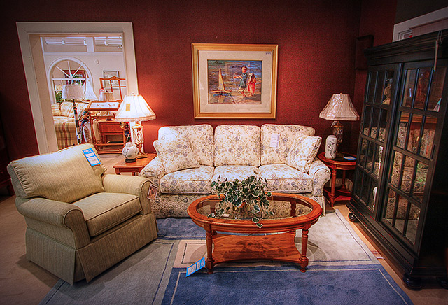
Whoa! Way underrated! What an elegant room and composition.
|
|
 Photographer found comment helpful. Photographer found comment helpful. |
|
|
03/12/2007 01:29:48 AM |
tone-mapped, but still appears to have blown-out highlights (seemingly, anyway). i find the red grains on the wall slightly distracting; while the distortion makes the photo tilted? i would personally have preferred a soft-glow treatment to this photo, btw. just my thoughts.
crayon |
|
| Photographer found comment helpful. |
Comments Made During the Challenge  |
|
|
03/10/2007 11:40:08 AM |
| Luckily we don't sell this kind of stuff, lol! Great colors and fun angle! |
|
| Photographer found comment helpful. |
|
|
03/08/2007 08:32:18 AM |
| maybe shouldn't have kept the price tags on the furniture |
|
| Photographer found comment helpful. |
|
|
03/07/2007 07:54:47 PM |
| The other lamp in the left draws away from the subject, maybe that should have been turned off also, |
|
| Photographer found comment helpful. |
|
|
03/06/2007 11:44:19 PM |
| very artistic..... and very home decor looking, just like the magazines. |
|
| Photographer found comment helpful. |
|
|
03/05/2007 05:23:40 PM |
| A little grainy, not very exciting, but it does fit the challenge. |
|
| Photographer found comment helpful. |
|
|
03/05/2007 04:37:58 PM |
| Well executed exposure but just a little boring in the subject matter. |
|
| Photographer found comment helpful. |
Home -
Challenges -
Community -
League -
Photos -
Cameras -
Lenses -
Learn -
Help -
Terms of Use -
Privacy -
Top ^
DPChallenge, and website content and design, Copyright © 2001-2025 Challenging Technologies, LLC.
All digital photo copyrights belong to the photographers and may not be used without permission.
Current Server Time: 03/12/2025 10:07:19 AM EDT.