| Author | Thread |
|
|
03/14/2007 10:32:00 AM |
Are you using the calming scents??? :o)
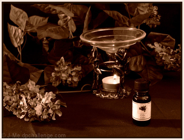
Fix your tilted bowl....heheh. This is pretty. The plants in the background give off that "earthy" feel. Nice! Sorry I did not get to vote in the challenge. |
|
 Photographer found comment helpful. Photographer found comment helpful. |
Comments Made During the Challenge  |
|
|
03/13/2007 09:47:44 PM |
| Looks a little out of focus. Not fond of the sepia treatment. Background is very busy |
|
|
|
03/13/2007 11:43:28 AM |
|
|
|
03/13/2007 09:08:17 AM |
|
| Photographer found comment helpful. |
|
|
03/11/2007 02:52:35 PM |
| I really like this concept, However, it is flat for me. I would like more contrast to this image, and also maybe a greater dof The stand seems a bit oof. Overall I enjoy this image. |
|
| Photographer found comment helpful. |
|
|
03/08/2007 06:33:04 PM |
| Very warm and serene �but the votive holder not only seems empty of fragrant solution, it also seems tilted. I love the monochromatic colors. |
|
| Photographer found comment helpful. |
|
|
03/08/2007 12:38:13 PM |
| Brightness is a bit dark for my taste. |
|
| Photographer found comment helpful. |
|
|
03/08/2007 11:29:44 AM |
| I'm not sure I dig the silk plants. the candle dish also seems tilted to the left (either the whole shot is or just the dish). 5 |
|
| Photographer found comment helpful. |
|
|
03/08/2007 10:00:18 AM |
I don't really like the black and white with color
Message edited by author 2007-04-30 21:44:27. |
|
| Photographer found comment helpful. |
|
|
03/08/2007 02:12:48 AM |
| nice tones, finally a convincing composition of (known) objects, maybe some more sharpness here and there, and the bowl is tilted... 7 |
|
| Photographer found comment helpful. |
|
|
03/07/2007 11:57:38 PM |
| I like the tones here..... |
|
| Photographer found comment helpful. |
|
|
03/07/2007 11:39:13 PM |
| The sepia look is a little too heavy and the composition is awkward - Just a bit too staged. |
|
| Photographer found comment helpful. |
|
|
03/07/2007 02:51:38 PM |
| Very pretty - I might have preferred a gentle desat in this rather than the sombre sepia. |
|
| Photographer found comment helpful. |
|
|
03/07/2007 01:07:33 PM |
|
| Photographer found comment helpful. |
|
|
03/07/2007 12:33:15 PM |
|
| Photographer found comment helpful. |
Home -
Challenges -
Community -
League -
Photos -
Cameras -
Lenses -
Learn -
Help -
Terms of Use -
Privacy -
Top ^
DPChallenge, and website content and design, Copyright © 2001-2025 Challenging Technologies, LLC.
All digital photo copyrights belong to the photographers and may not be used without permission.
Current Server Time: 03/12/2025 02:47:48 AM EDT.