| Author | Thread |
Comments Made During the Challenge  |
|
|
03/19/2007 11:32:33 PM |
| like the idea, but the photo just seems so "normal" to me. Does that make sense? and the blur at the bottom, probably from a table top, could have been cropped out. |
|
|
|
03/19/2007 03:38:28 PM |
|
|
|
03/18/2007 05:11:27 AM |
| A less busy background would have given the subject more visual impact. Also, it looks like you put the camera on a table to shoot; cropping out the bottom part would also keep distractions to a minimum. |
|
|
|
03/18/2007 02:15:47 AM |
| There is a blurred line in the bottom right of your photo which could have been cropped out to make a better image. Also the background of your image is quite distracting. |
|
|
|
03/17/2007 09:35:40 PM |
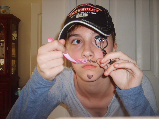
| I haven't seen one of those eyelash curlers in a long time ... these days it's likely to be mistaken for somethng used in one of those CIA secret prisons! |
|
|
|
03/16/2007 10:21:56 PM |
| lighting is harsh (on camera flash in Never your friend) |
|
|
|
03/16/2007 04:24:31 PM |
| Interesting idea. The hat is good. Painted on "facial hair" is not. The background is too busy -- it distracts from the subject. |
|
|
|
03/15/2007 10:25:24 AM |
| I like the idea, but the execution is a bit clumsy. Furthermore, harsh shadows and the busy backrgound lower IQ. |
|
|
|
03/15/2007 12:55:41 AM |
| be more thoughtful about the photograph rather than the outfit. |
|
|
|
03/14/2007 11:54:37 PM |
| The background is distracting and it takes away from the picture. |
|
|
|
03/14/2007 09:58:19 PM |
| Kinda out of focus, and the back is distracting-3 |
|
|
|
03/14/2007 07:50:06 PM |
| okay, this is a girl trying to look like a guy looking like a girl. Just hit the Office Depot EASY button and see what happens. |
|
|
|
03/14/2007 06:09:38 PM |
| Might have looked better in black and white. |
|
|
|
03/14/2007 12:24:22 PM |
|
|
|
03/14/2007 10:59:02 AM |
| Really good idea, but the photo could be a bit stronger if it was cropped to remove the cupboard on the left hand side. Lighting could also be a bit better. |
|
|
|
03/14/2007 10:20:26 AM |
| snapshot, bad shadows/lighting, bad title |
|
|
|
03/14/2007 09:41:09 AM |
| I like the idea you were going for here, but it seems to need a little more polish. There are a couple of issues with this one that bring it down for me. First, the image really needs to be cropped differently. The fuzzy white line at the bottom of the image needs to be cropped out, and the cabinet on the left side of the image is distracting Second, the lighting with the flash is very harsh and looks like a quick snapshot. I think a different perspective where we see you looking in the mirror, holding both the eyelash tool and the razor (with stubble on face) and a look of which do I do today would have worked better. Having both your hands up to your face doesn't seem to work really well for me, and covers up a nice face! |
|
|
|
03/14/2007 09:31:43 AM |
| Funny, but not very well executed. Looks more like a snapshot, but maybe that was your intent. I'd have set it up a bit more and really made her look more "manly." |
|
|
|
03/14/2007 08:55:11 AM |
| the lighting feels a little flat,and the furniture is a little distracting, may have worked better in a bathroom, but good work. |
|
|
|
03/14/2007 07:48:31 AM |
| Wow, I can even tell which way this one crosses for sure... |
|
|
|
03/14/2007 06:04:00 AM |
| Hehehehe...cute pink razor! |
|
Home -
Challenges -
Community -
League -
Photos -
Cameras -
Lenses -
Learn -
Help -
Terms of Use -
Privacy -
Top ^
DPChallenge, and website content and design, Copyright © 2001-2025 Challenging Technologies, LLC.
All digital photo copyrights belong to the photographers and may not be used without permission.
Current Server Time: 03/11/2025 02:08:00 PM EDT.